UX Design

Competitor Analysis

Developer Handoff

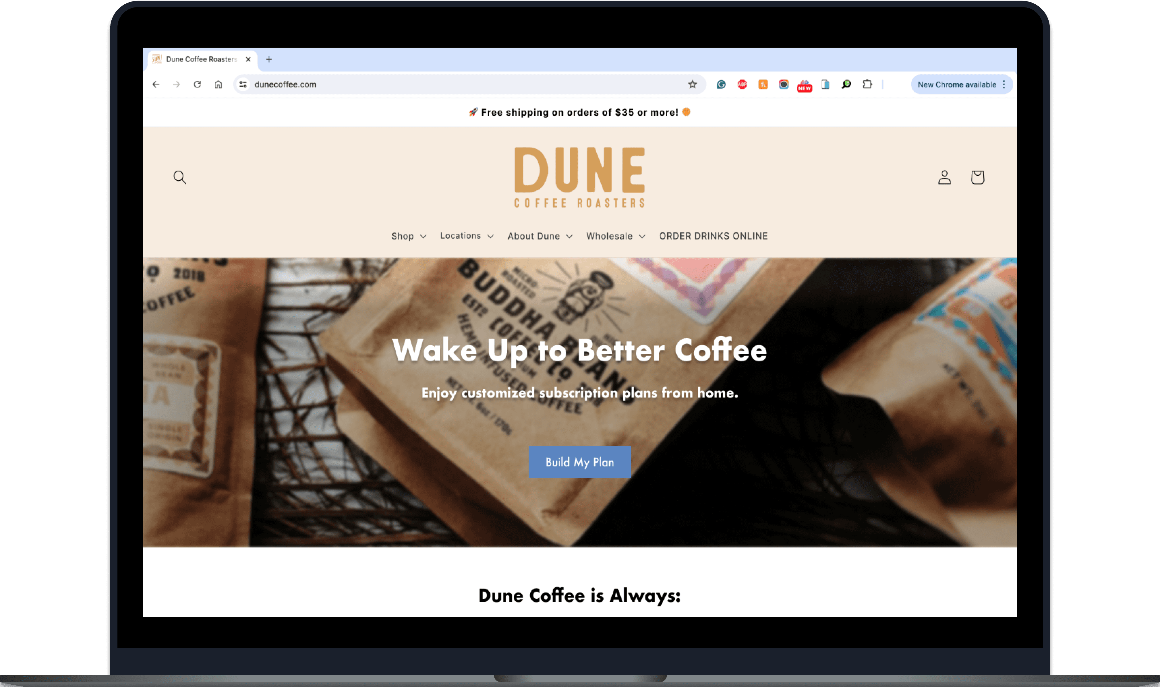
Dune Coffee Roasters Subscription-Based Landing Page

Designing a subscription-based landing page to improve the discovery and ordering experience for new customers.

Role

UX Designer

Timeline

February - March 2023 (5 weeks)

Team

Andres Moreno (Lead Developer)

Project Brief

Dune Coffee is a well-established local brand based in Santa Barbara. Hoping to expand their online subscription service, the company wanted a new subscription-based landing page as a part of a social media marketing campaign.

As the UX Designer for this project, I was responsible for six deliverables. My primary goals were to:

  • Identify distinct user groups.

  • Analyze, dissect, and learn from key competitor websites.

  • Redefine user journeys to address user needs and pain points.

Competitor analysis

User personas

User journey map

Usability testing and insights

Mid-fidelity prototype

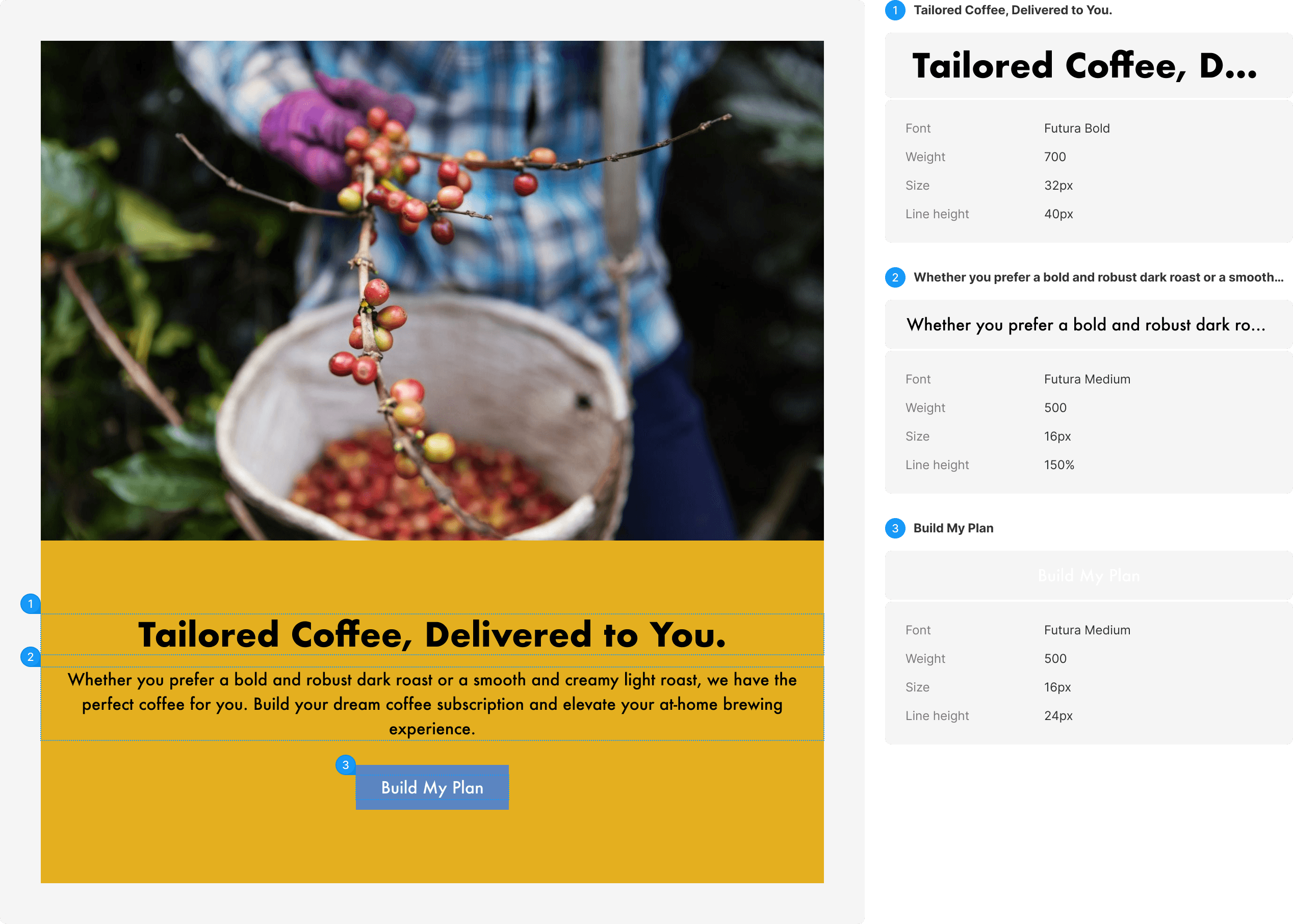
Developer hand-off documentation

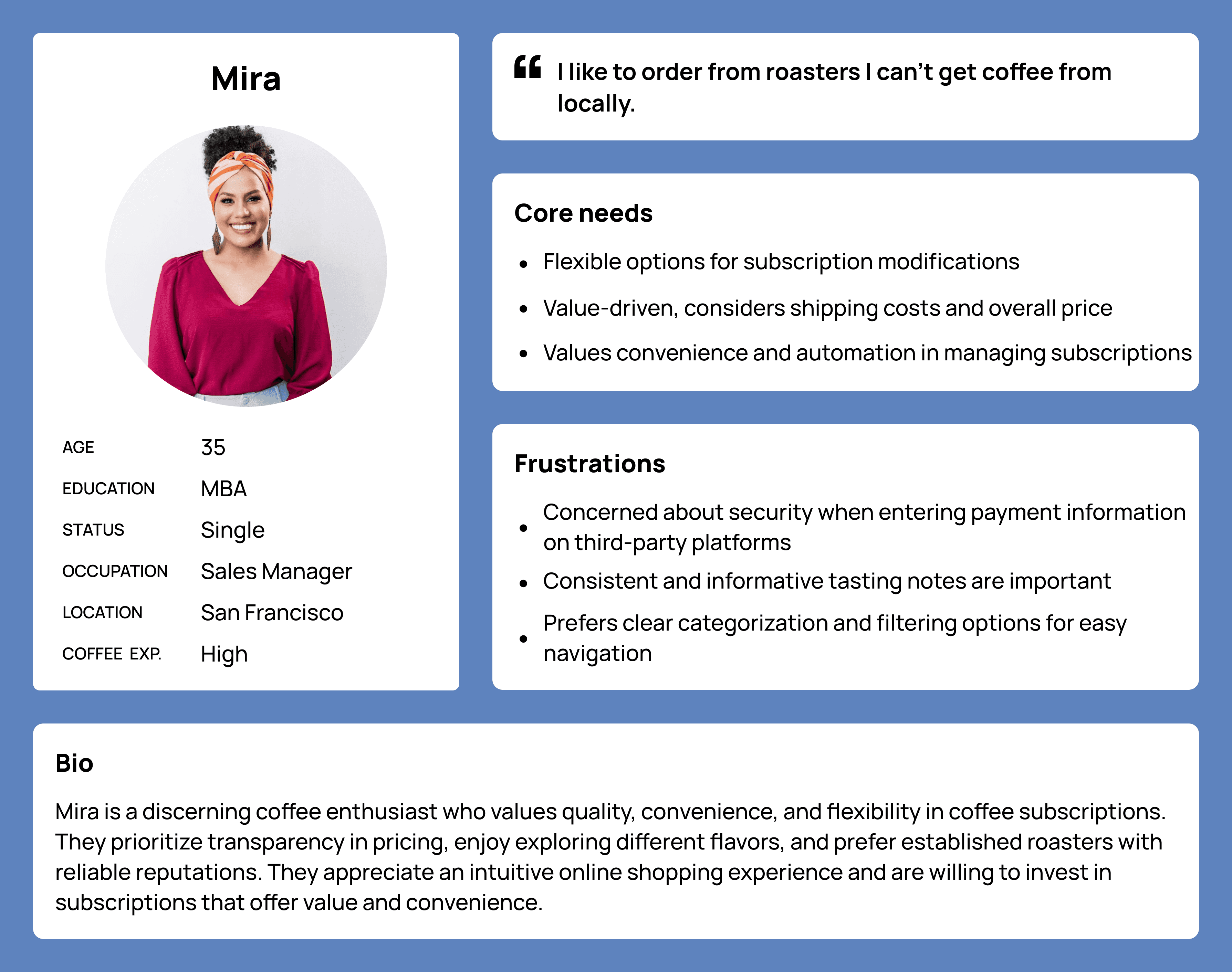
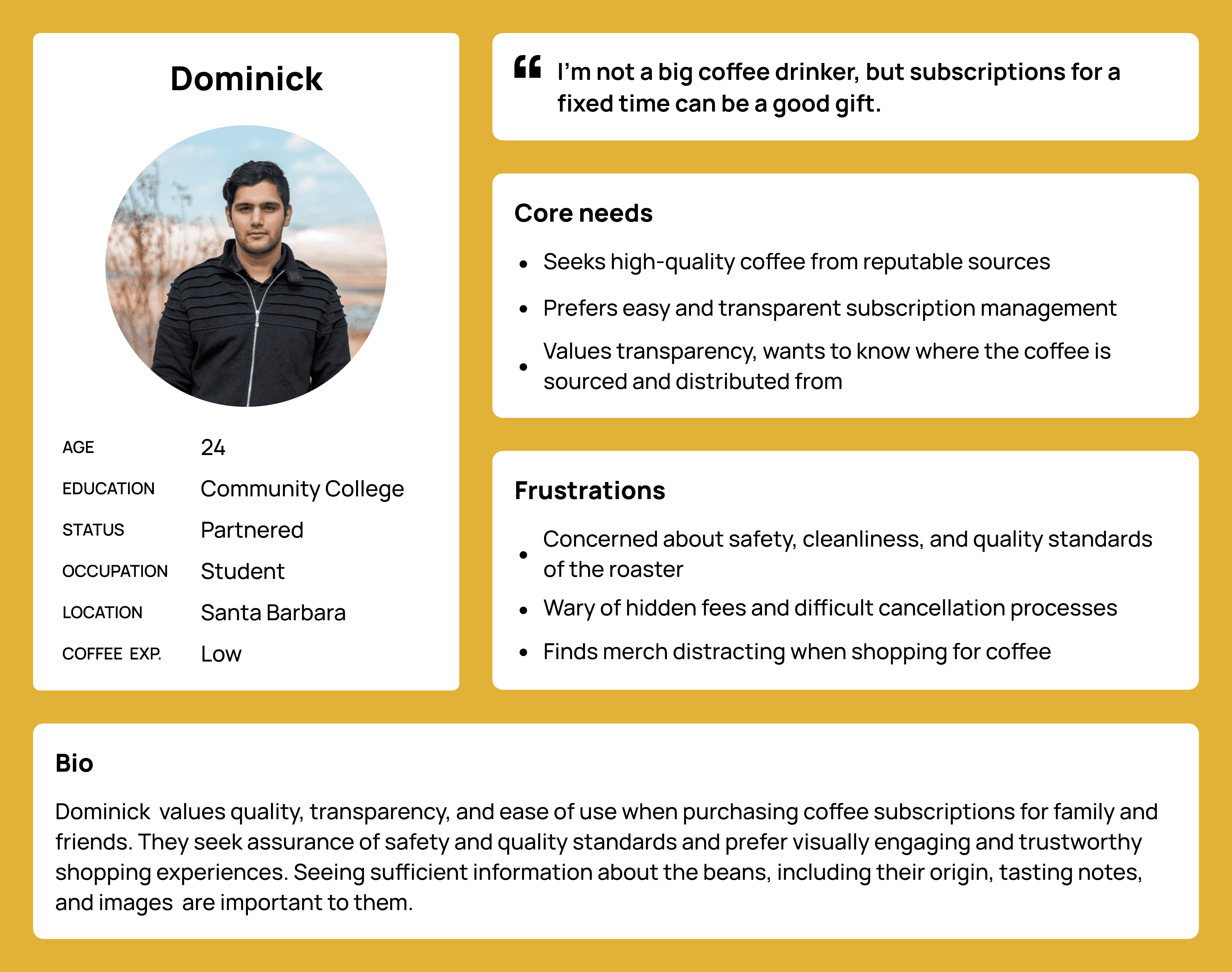
Understanding the Users

Initial interviews and testing revealed that online subscription customers are often a different demographic from Dune’s traditional audience, coffee enthusiasts looking to spend time in a coffee shop or purchase beans and drinks from local favorite spots.

Initial interviews and testing revealed that online subscription customers are often a different demographic from Dune’s traditional audience, coffee enthusiasts looking to spend time in a coffee shop or purchase beans and drinks from local favorite spots.

Initial interviews and testing revealed that online subscription customers are often a different demographic from Dune’s traditional audience, coffee enthusiasts looking to spend time in a coffee shop or purchase beans and drinks from local favorite spots.

Online Customer 1: Mira

Online Customer 2: Dominick

In summary, online customers:

  • often purchase beans from roasters they don’t have access to locally.

  • value transparency, convenience, customization, and flexibility.

  • will purchase coffee subscriptions as gifts.

In summary, online customers:

  • often purchase beans from roasters they don’t have access to locally.

  • value transparency, convenience, customization, and flexibility.

  • will purchase coffee subscriptions as gifts.

In summary, online customers:

  • often purchase beans from roasters they don’t have access to locally.

  • value transparency, convenience, customization, and flexibility.

  • will purchase coffee subscriptions as gifts.

The Original User Journey

I conducted initial testing to understand the following questions:

  • How difficult is it for users to locate, select, and purchase a coffee subscription?

  • Where do users get stuck or confused?

I conducted initial testing to understand the following questions:

  • How difficult is it for users to locate, select, and purchase a coffee subscription?

  • Where do users get stuck or confused?

I conducted initial testing to understand the following questions:

  • How difficult is it for users to locate, select, and purchase a coffee subscription?

  • Where do users get stuck or confused?

Findings

  • Users struggle to learn more about subscription contents and details.

  • There is no clear way to gift subscriptions, and subscription cancellation is manual.

  • Subscriptions listed as products don’t align with users’ mental models of subscriptions as services.

  • Users struggle to learn more about subscription contents and details.

  • There is no clear way to gift subscriptions, and subscription cancellation is manual.

  • Subscriptions listed as products don’t align with users’ mental models of subscriptions as services.

  • Users struggle to learn more about subscription contents and details.

  • There is no clear way to gift subscriptions, and subscription cancellation is manual.

  • Subscriptions listed as products don’t align with users’ mental models of subscriptions as services.

Problem Statement

Users purchasing subscriptions for themselves or others online need a convenient way to discover, evaluate, and manage subscriptions so that they can save time and feel confident in their purchases.

Challenges and Constraints

Learning more about users and refining my understanding of the problem revealed a key flaw in the framing of this project. Though I was tasked with creating a landing page, a landing page could not solve all of the needs identified in my initial research. Starting with a solution can be detrimental because it assumes the problem.


Unfortunately, the project scope was not negotiable, so I attempted to address the needs within my designs for a landing page, knowing the solution would be limited.

Learning from Competitors

Competitor analysis focused on understanding the subscription ordering experience of two main competitor groups:

Competitor analysis focused on understanding the subscription ordering experience of two main competitor groups:

Local Competitors

Leading Coffee Subscription Companies

After evaluating strengths and growth areas of competitors, I identified six essential components for subscription-based coffee landing pages.

  1. A clear call to action and multiple click-paths to subscriptions.

  1. Familiar, trusted payment options.

  1. Unique, specific, visible value proposition, supported by reasons to believe.

  1. The ability to purchase subscriptions as gifts.

  1. A specific description of subscription contents.

  1. Flexible and customizable subscription plans.

Ideation, Evaluation, and Iteration

Using a refined understanding of user needs and insights from competitor analysis, I sketched several versions of a landing page building upon the site’s existing coffee preference quiz. This quiz appeals to users who are less familiar with coffee or want to purchase a subscription as a gift.

Using a refined understanding of user needs and insights from competitor analysis, I sketched several versions of a landing page building upon the site’s existing coffee preference quiz. This quiz appeals to users who are less familiar with coffee or want to purchase a subscription as a gift.

Using a refined understanding of user needs and insights from competitor analysis, I sketched several versions of a landing page building upon the site’s existing coffee preference quiz. This quiz appeals to users who are less familiar with coffee or want to purchase a subscription as a gift.

Version 1 featured a “how it works” section outlining the subscription process.

Version 2 prioritized a “reasons to believe” section and a completion bar for an embedded quiz.

Version 3 included an expanding scrollable version of the quiz to shorten click-paths.

Why Choose a Coffee Quiz?

Initial ideation was unbounded by constraints and considered global approaches to addressing the key issues expressed by users. Once it became clear that these options were not feasible, I posed the following question:

How might we empower users to find the perfect subscription within a landing page design?

A quiz model can accommodate multiple of the essential components for subscription-based landing pages while providing simple implementation of the missing ones in subsequent projects targeting global revisions. Ideally, information architecture, product descriptions, and payment options could be updated to satisfy all of the aforementioned components.

Low to Mid-Fildelity Testing and Iterations

Combining concepts from the initial sketches following debrief sessions with the developer resulted in two low-fidelity wireframes. The first offered a streamlined path into a coffee preference quiz, while the second version placed a heavier emphasis on the value proposition of subscriptions.

Mid-fidelity designs ultimately expanded on the second version and used clear call-to-action buttons to simplify the process. The progress bar in the second and third iterations allowed users to visualize their time investment in the product, a strategy intended to optimize conversion rates and reduce drop-offs.

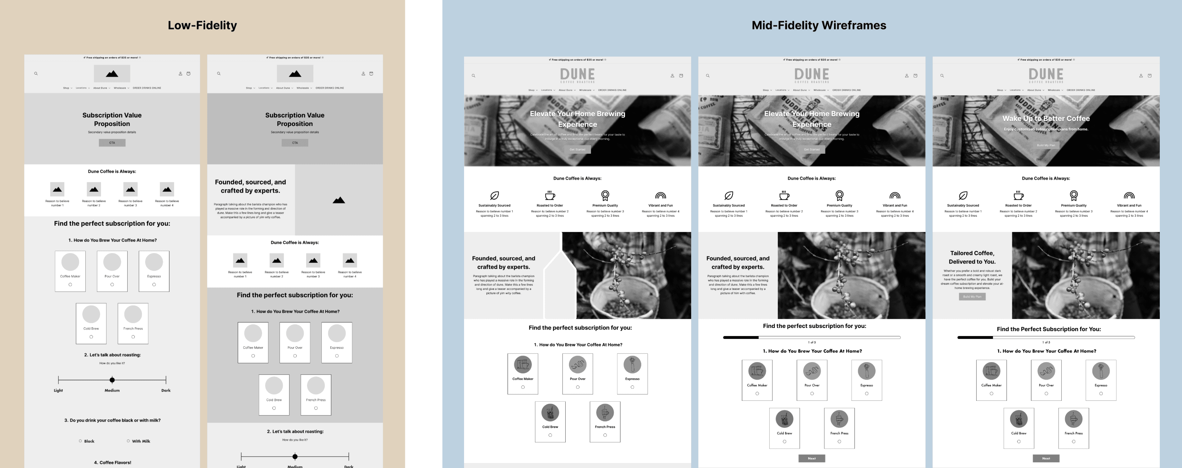
Further guerrilla testing and 5-second tests were conducted to evaluate performance and impressions of the designs.

While participants were confused by the gray-scale color scheme and placeholder content, they easily understood the purpose of the landing page and found the process intuitive to complete.

Though some necessary content was not provided prior to hand-off, I created a written-content inventory to document any missing content the team would need.

Under ideal circumstances, I would have made the following adjustments:

  • Replace placeholder images with product shots of Dune coffee

  • Supply additional details about individual subscription products such as roasting notes

  • Add an additional section that allows users to browse and purchase subscriptions without completing the quiz.

Developer Handoff

In preparation for hand-off to the developer, I provided documentation for section anatomy, spacing details, and mid-fidelity mockups at three break-points. The company provided a brand style-guide, and I expanded upon it by clarifying inconsistencies in typography and defining a layout grid.

In preparation for hand-off to the developer, I provided documentation for section anatomy, spacing details, and mid-fidelity mockups at three break-points. The company provided a brand style-guide, and I expanded upon it by clarifying inconsistencies in typography and defining a layout grid.

In preparation for hand-off to the developer, I provided documentation for section anatomy, spacing details, and mid-fidelity mockups at three break-points. The company provided a brand style-guide, and I expanded upon it by clarifying inconsistencies in typography and defining a layout grid.

Anatomy

Spacing

Final Designs

Outcomes and Conclusions

The project briefly went live but was modified by another team before we could collect data and iterate accordingly. Though this was a disappointing result for me, I am proud of the work I produced given the constraints and have learned the importance of advocating for the inclusion of designers’ voices in stakeholder meetings. Without the context behind the research-driven process, stakeholders had to form opinions solely upon visual designs containing placeholder content. The project constraints of making a landing page prevented multiple opportunities identified in my research from being addressed.

Issues such as increased trust in payment options, flexible and transparent gift subscription models, and additional information about individual subscriptions would be better addressed by more drastic changes to the user journey and information architecture.

In the future, I would request to present these findings with stakeholders early on so the solution has a better chance at completely addressing user needs.

The project briefly went live but was modified by another team before we could collect data and iterate accordingly. Though this was a disappointing result for me, I am proud of the work I produced given the constraints and have learned the importance of advocating for the inclusion of designers’ voices in stakeholder meetings. Without the context behind the research-driven process, stakeholders had to form opinions solely upon visual designs containing placeholder content. The project constraints of making a landing page prevented multiple opportunities identified in my research from being addressed.


Issues such as increased trust in payment options, flexible and transparent gift subscription models, and additional information about individual subscriptions would be better addressed by more drastic changes to the user journey and information architecture.


In the future, I would request to present these findings with stakeholders early on so the solution has a better chance at completely addressing user needs.