Xavier Talwatte, Priscilla Huff, Shaina Prasad, Dillon Marks
UX/UI Designer
3-week team design sprint
3-week individual iterations
Challenge
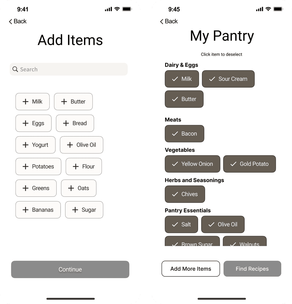
Recip.ai had a complicated pantry interface inspired by competing products. This original design made the app difficult to use on the go, and the user flow was confusing and time-consuming. The app also had several technical feasibility issues, making it impossible for developers to build.
Results
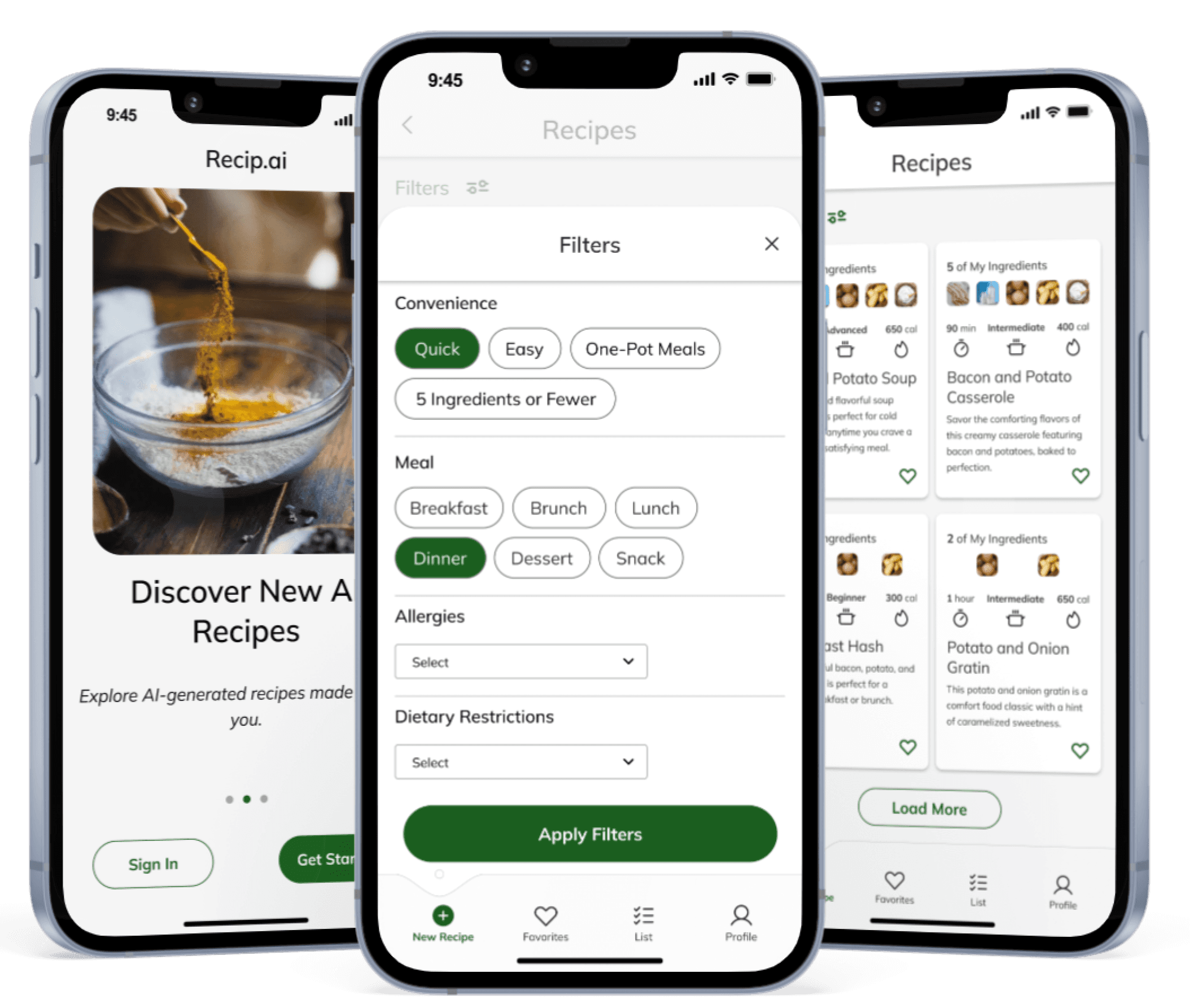
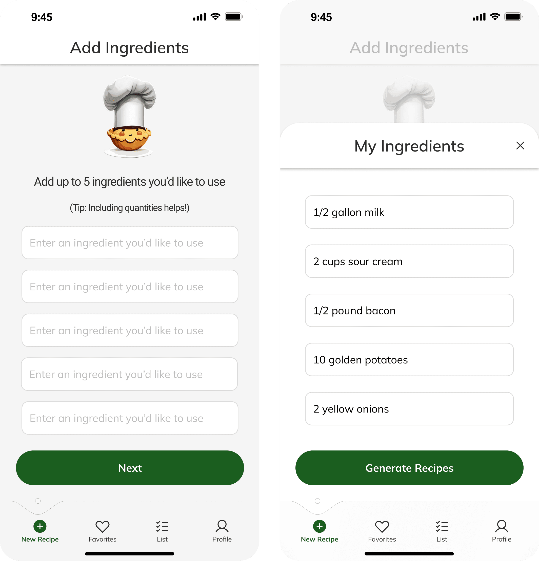
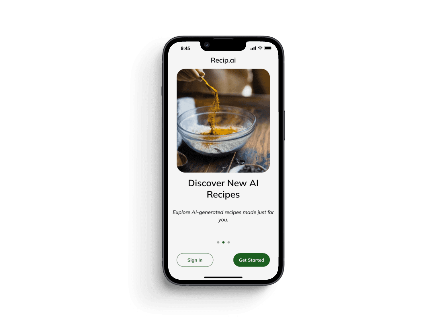
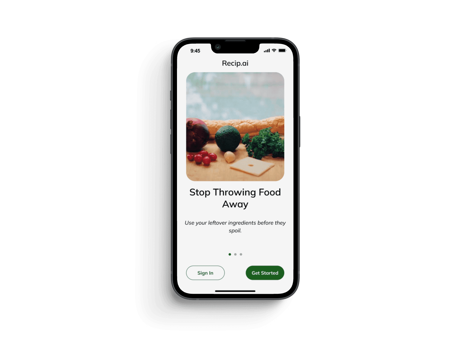
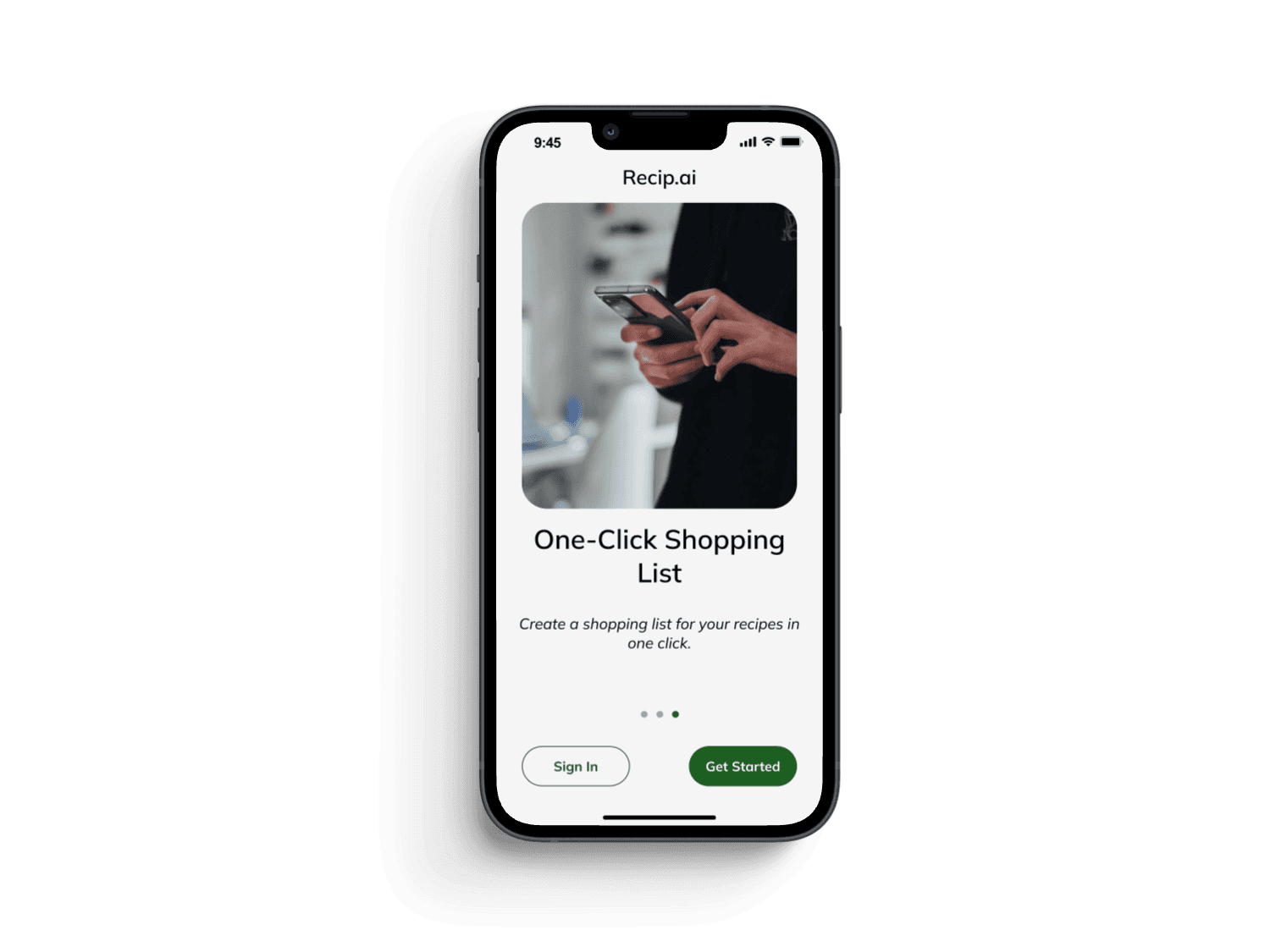
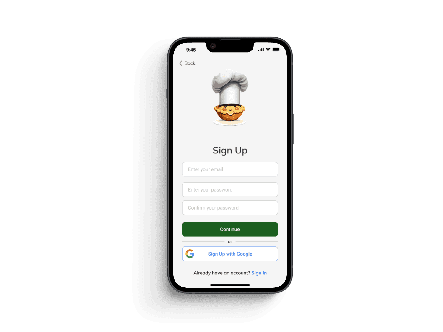
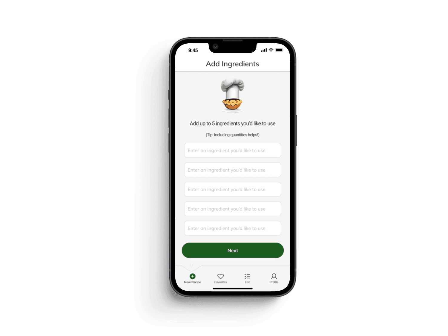
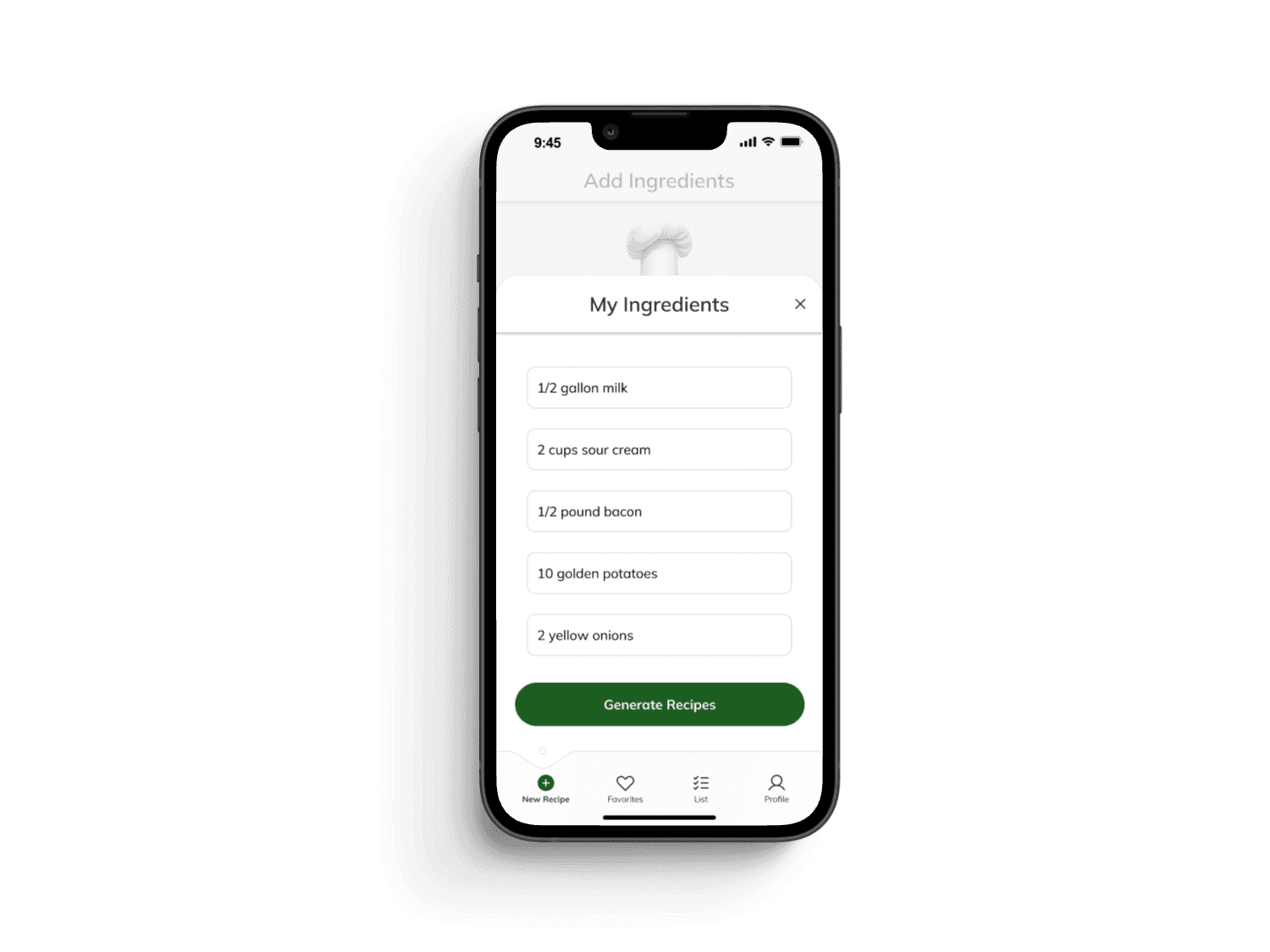
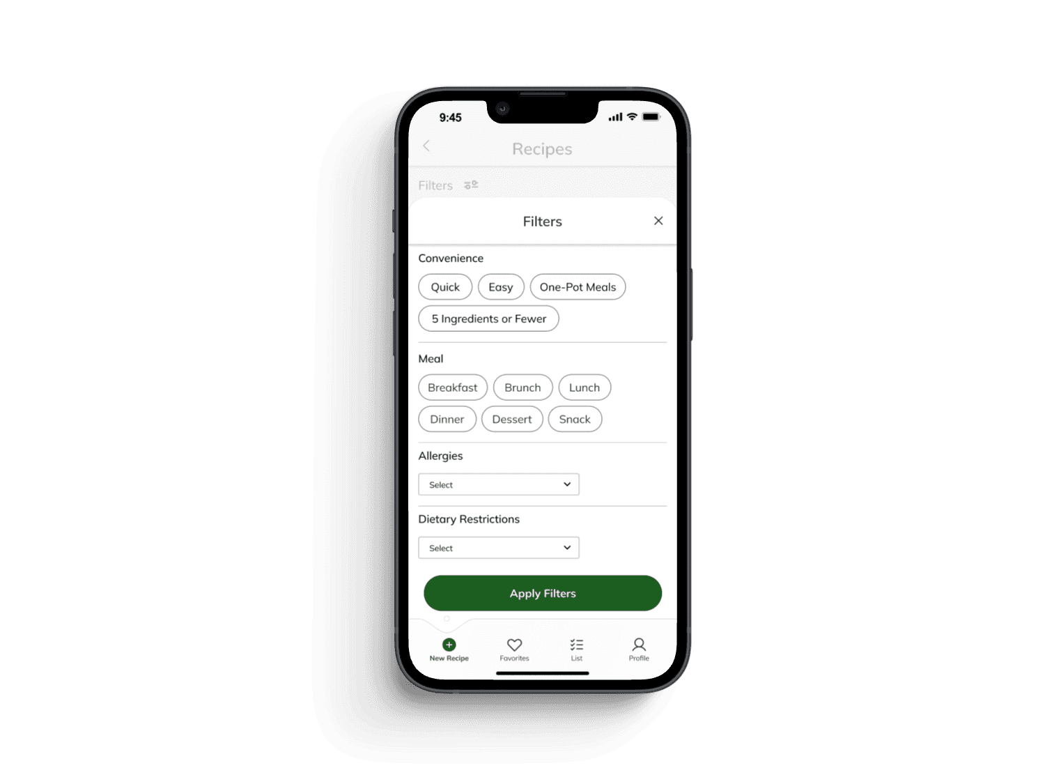
The redesigned app features a clean, clutter-free interface, and a streamlined user flow, making it easier for users to navigate and access essential features.
The improved interface informed by user research resulted in a 166% increase in conversion rates.
The addition of a revamped ingredient selection flow enhanced ease and convenience of use, leading to a 55% reduced total cycle time and an improvement of 79.6% in user satisfaction.
Improved Conversion Rate
Reduced Total Cycle Time
Improved User Satisfaction
Process: Original Designs
Ideation:
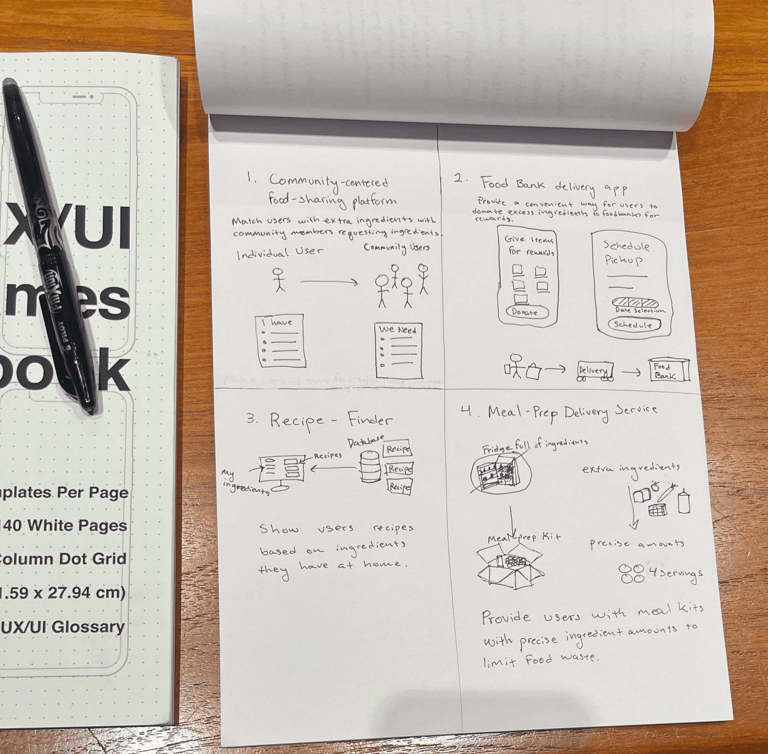
Based on our research findings, we used brainstorming activities like Crazy Eights and How Might We to ensure we had a wealth of ideas to pull from, prioritizing features according to user needs.
Design, Refine, Combine:
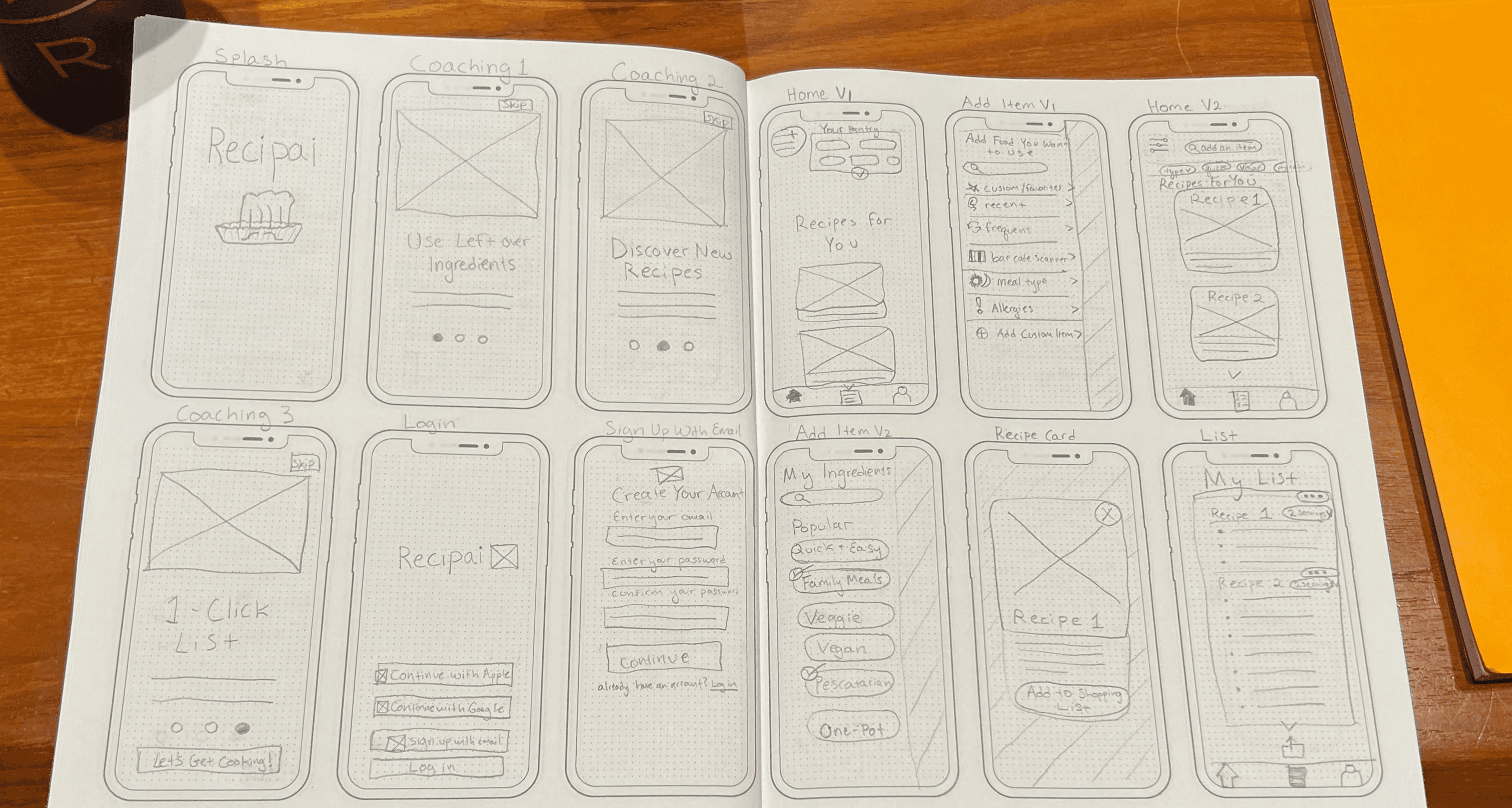
We each individually designed low-fidelity wireframes to visualize four different approaches based on a singular flow, combining features from each via dot voting.
Establishing Success Criteria:
In order to evaluate the performance of our designs, we established KPIs to use as success criteria.
User satisfaction
Total cycle time
Conversion rate
We selected these KPIs because we wanted to make sure that our product would be useful and convenient for users; hopefully, this would help us build an app people would use.
Usability Testing:
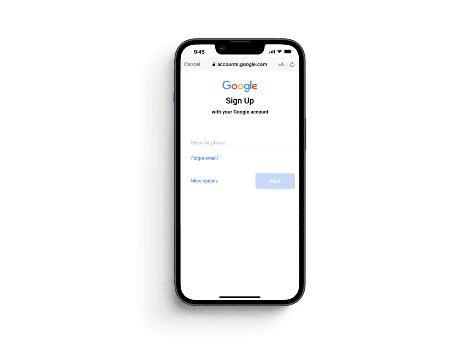
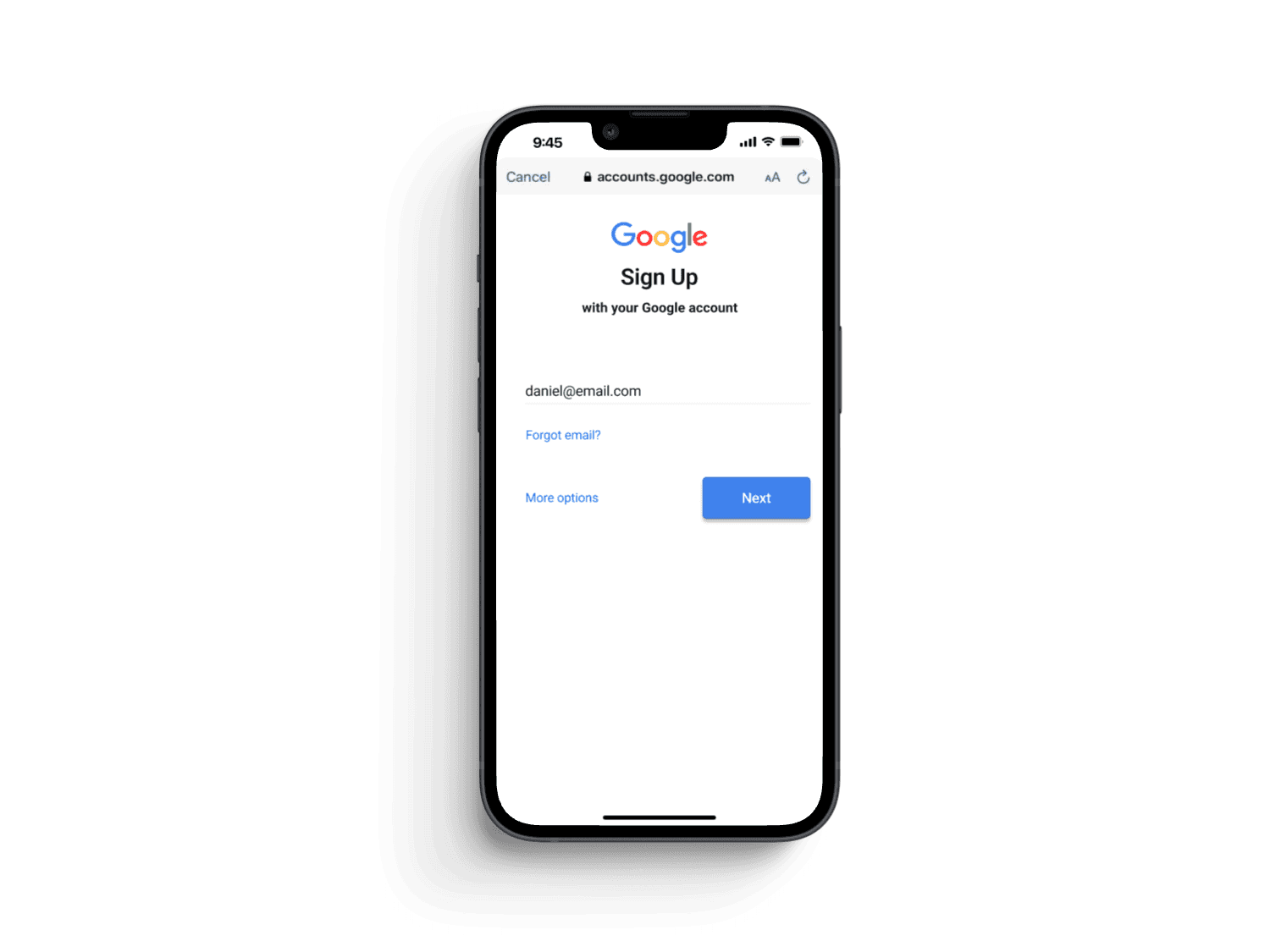
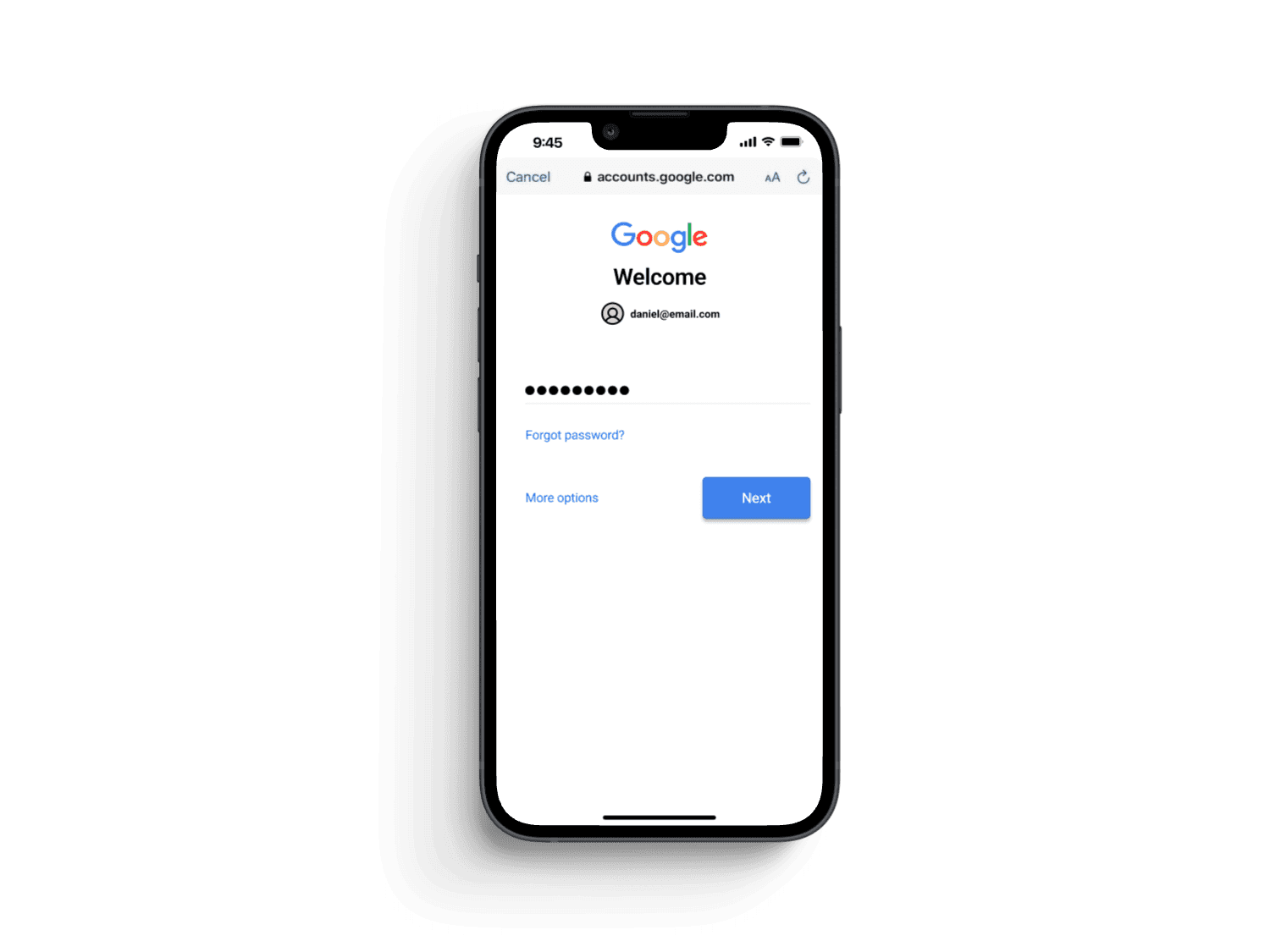
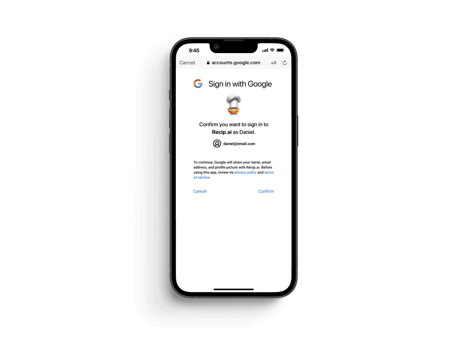
We conducted usability tests to identify areas for improvement. Over two rounds of remote, moderated usability testing, we simplified login options, reducing error rates by 75%. We also resolved several p0 insights and found a 25% decrease in reported confusion related to the pantry page.
Outcomes:
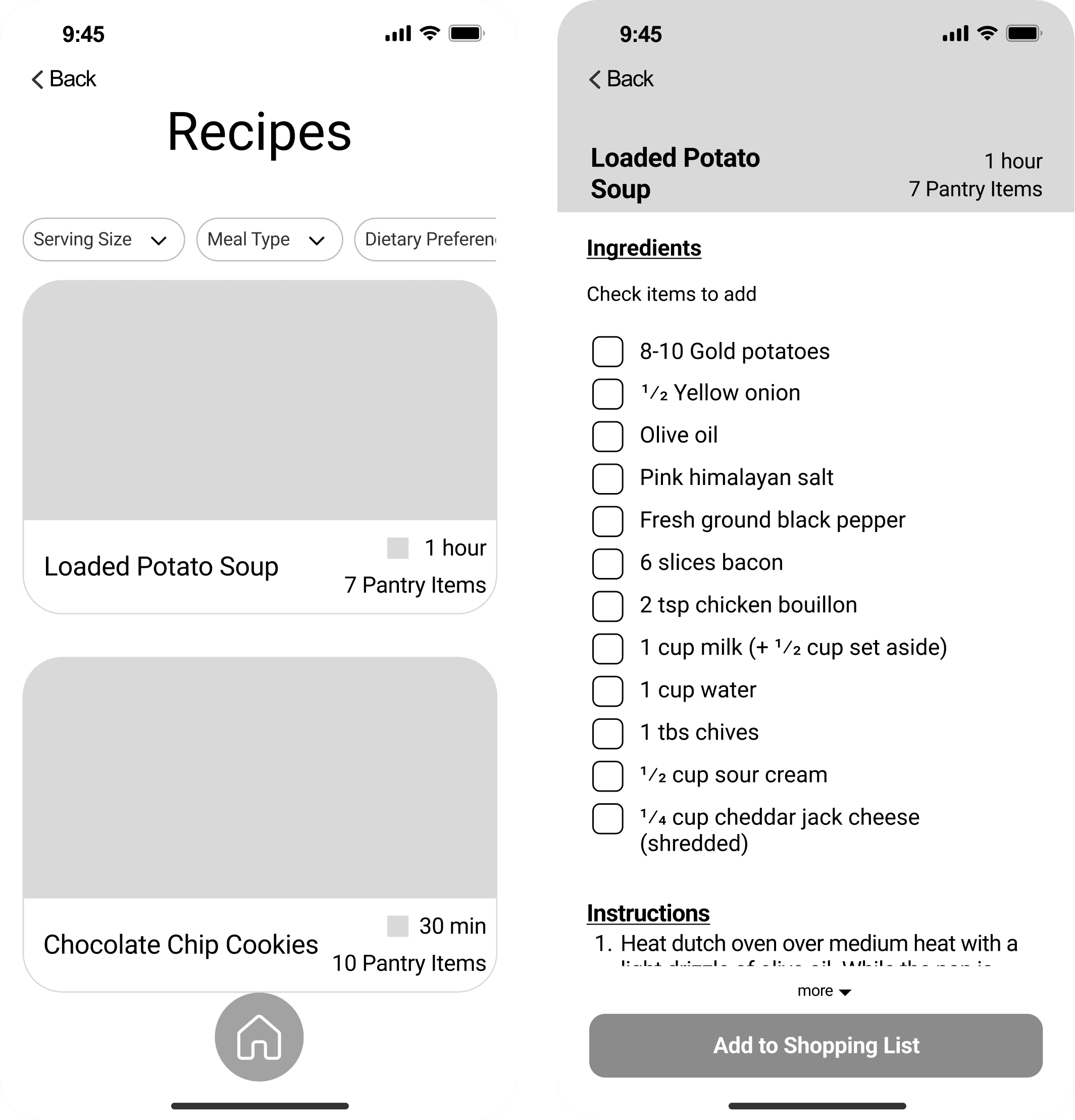
We developed a refined low-fidelity prototype for our concept that showed promise in terms of desirability; many usability study participants liked the idea and shared they would be likely to use the app if convenience and ease of use were improved. However, a complicated pantry interface and unclear user flow made the app inefficient and confusing.
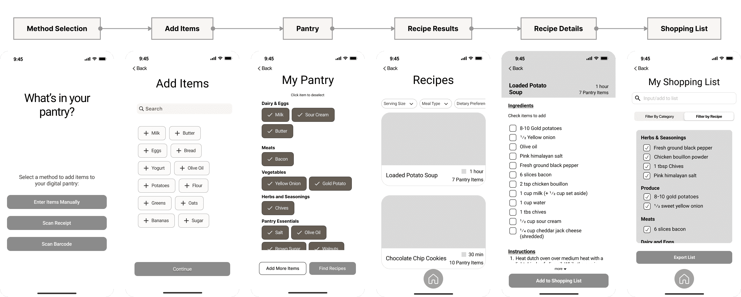
The original flow featured 6 key screens where a user could add items to a digital pantry and receive recipe recommendations based on ingredients they had at home. If they were missing any ingredients, they could generate a shopping list for missing ingredients.
Process: Revised Designs
KPI Assessment:
After concluding the 3-week design sprint, I evaluated the performance of our designs by quickly conducting usability tests with 11 participants and identified key areas for improvement:
The user flow was overly complicated, resulting in long total cycle times. (2:25)
Users didn't like the pantry page, resulting in lower satisfaction with the product. (49%)
Conversions struggled because of convenience, level of fidelity, and confusion. (27%)
Revisiting Competitor Analysis:
Our original competitor analysis focused on what we could learn from the successes and failures of competing products, but after the KPI assessment, I had new doubts about some competitor features and wanted to re-evaluate them.
Key Findings:
Recipe-finder products were heavily reliant upon databases and struggled to find recipes as users added more ingredients.
Using AI tools to manually generate recipes is effective but time-consuming. Precise prompts are required for adequate information, and the interface is not user-friendly.
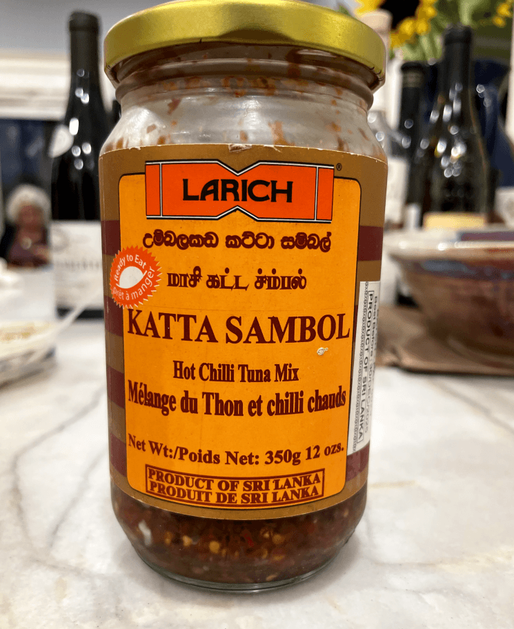
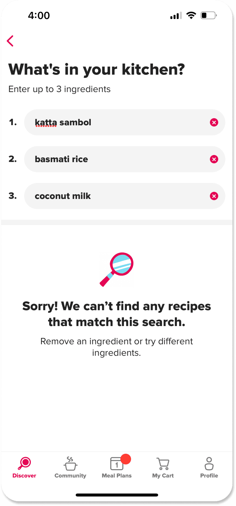
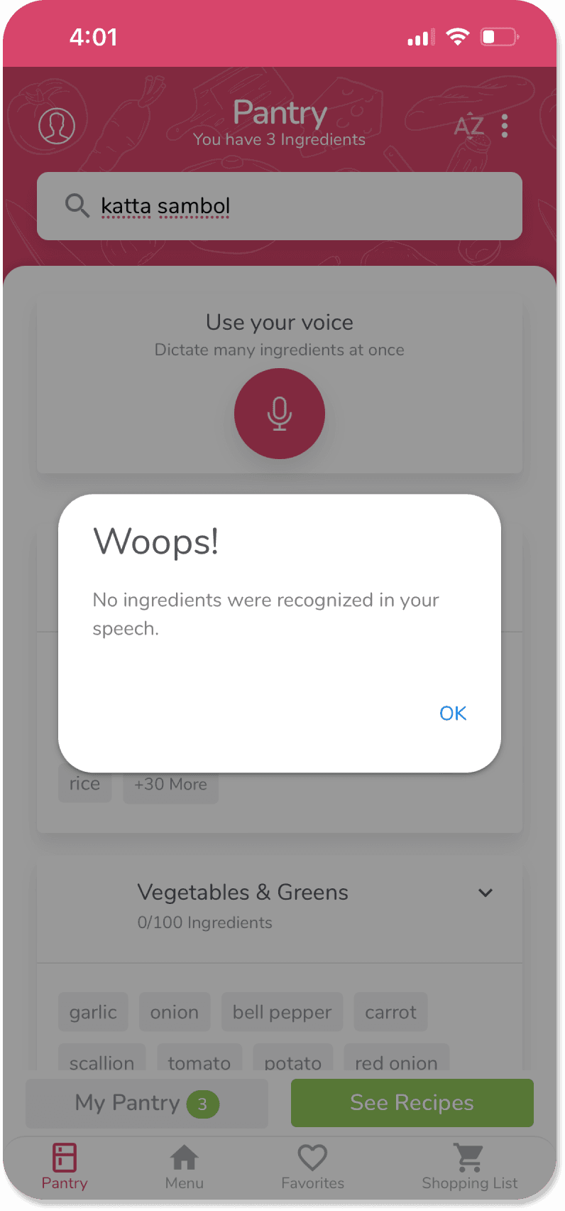
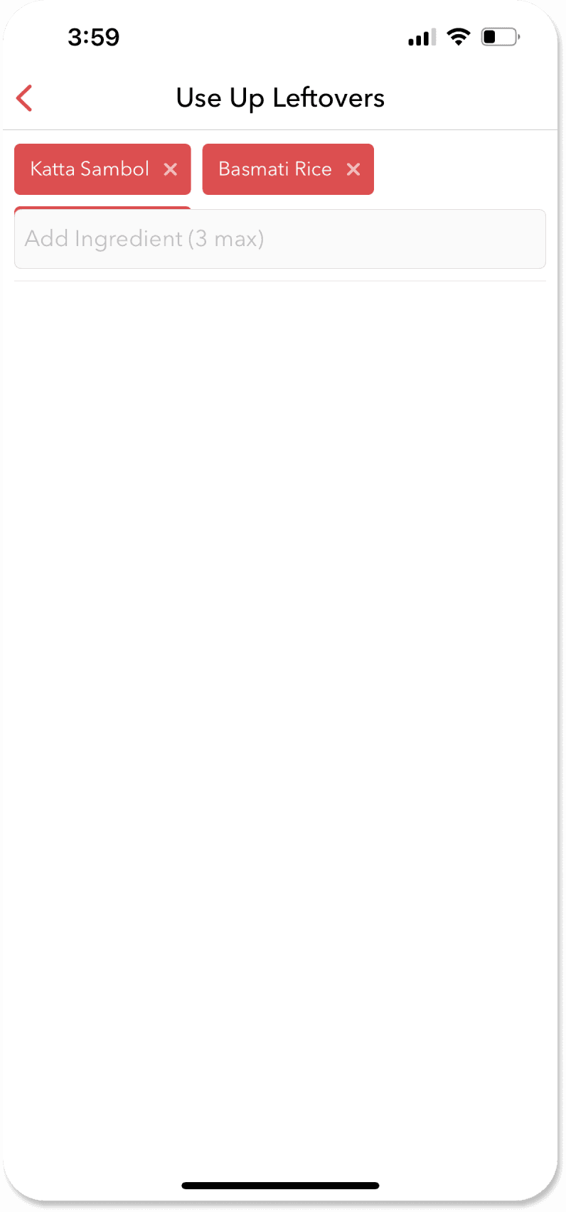
Non-AI competitors fail the Katta Sambol Test.
The Katta Sambol Test:
One of the unique weaknesses of recipe-finder products is that if they don't have your ingredient in their database, you're toast! (pun intended). To stress-test these competing products, I found a unique ingredient from my parents' fridge. Katta Sambol, a Sri Lankan condiment with a spicy, tangy flavor, seemed like the perfect test. This test helped validate Recip.ai as a concept. Seeing it succeed in cases where others failed assured me that it was on the right track.
Key Takeaways:
Validation of concept and unique value proposition.
Competitors struggle with unique ingredients.
Recip.ai would not rely upon databases for recipes, and some things can't be built the same way as competitors.
Challenge 1:
Initially, we assumed that users would be at home while using the app. This is evident through the layout of the pantry page (inspired by competing products), which prompts users to input all of their available ingredients. Users won't always be at home to check their available ingredients.
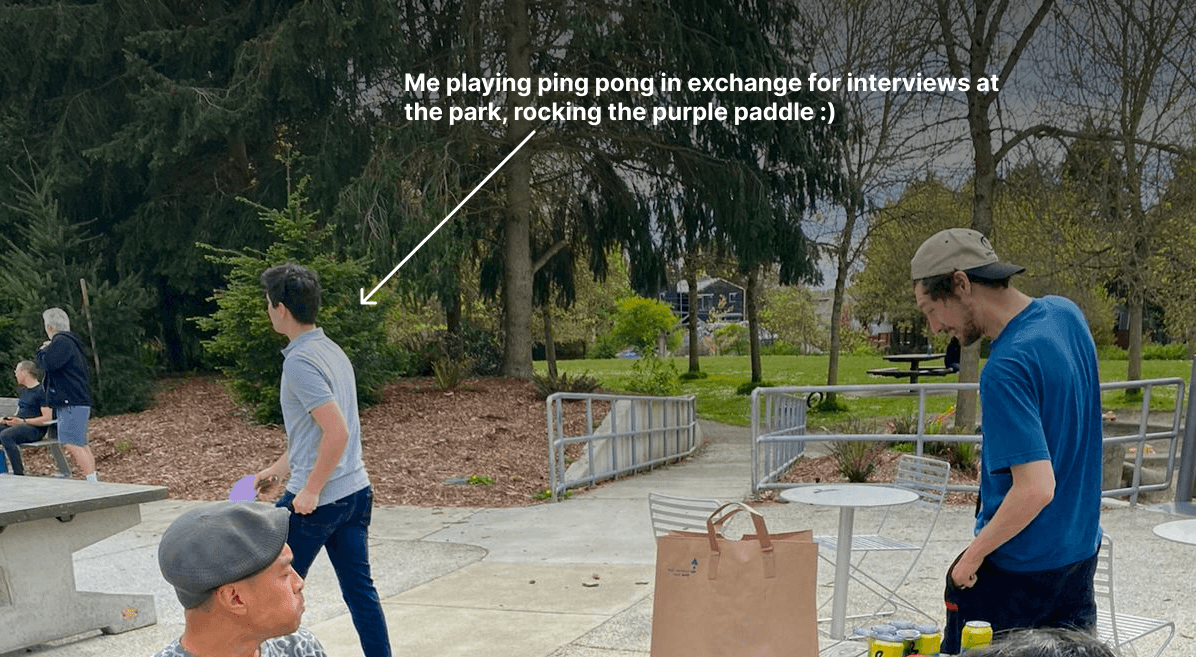
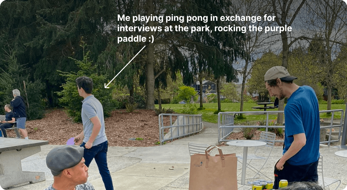
I tackled this problem by stepping away from my fridge (and computer screen) to visit a local park. There, I interviewed 5 people to better understand how users plan dinner when away from home.
Challenge 2:
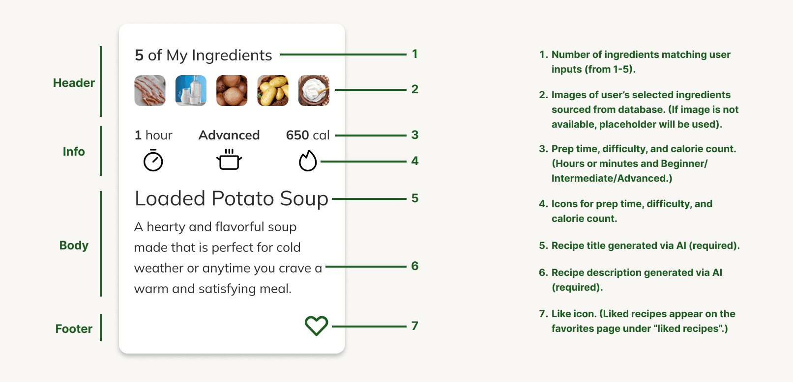
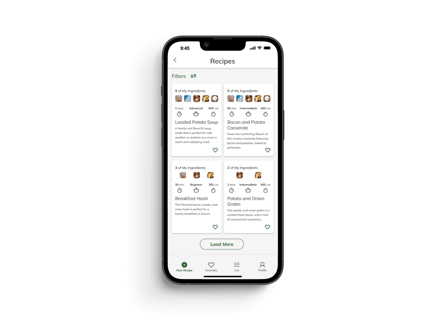
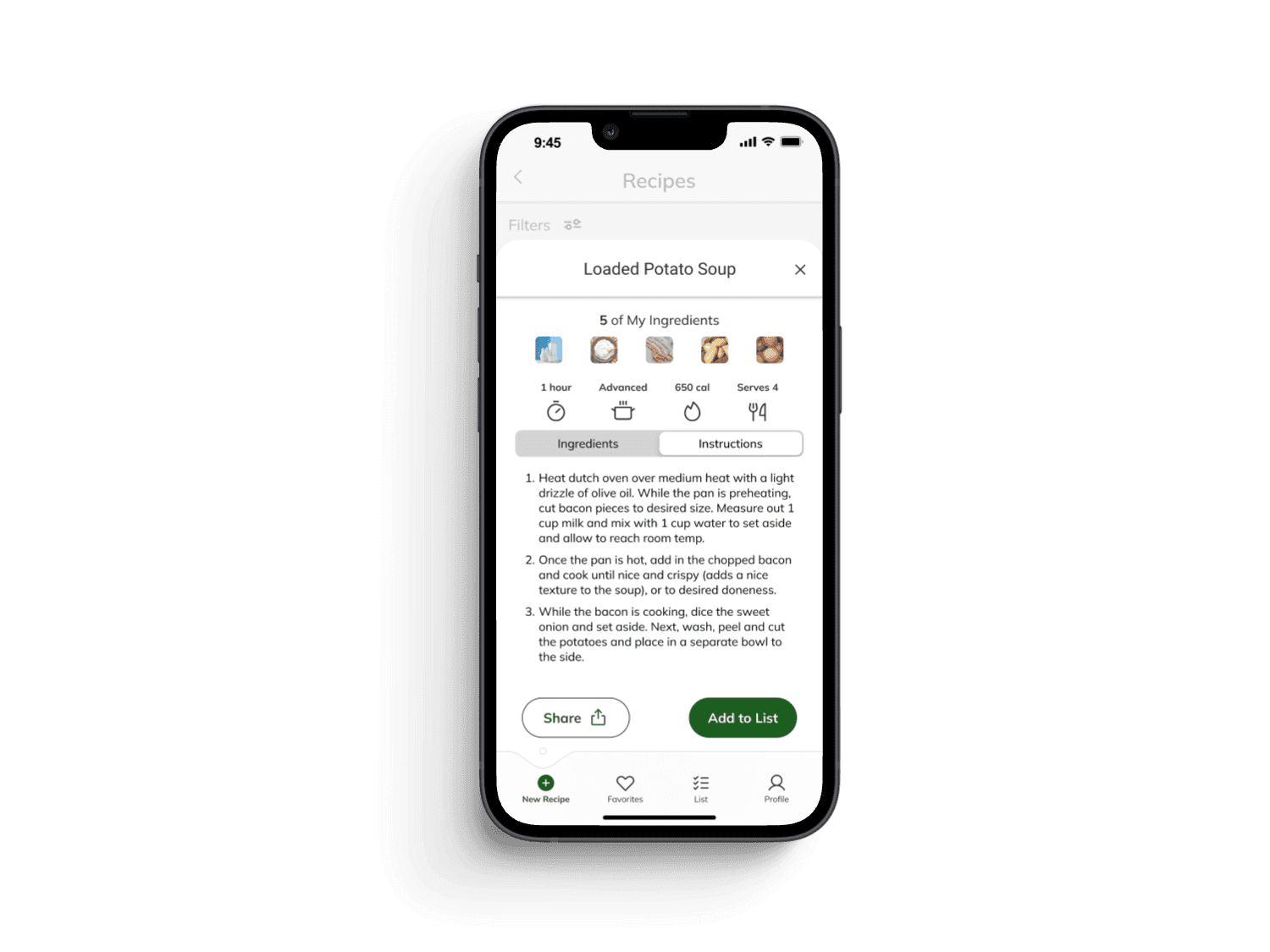
Our recipe card design was based on the assumption that we would have a database of images to pull from. However, Recip.ai would not work this way, since it generates recipes on the spot.
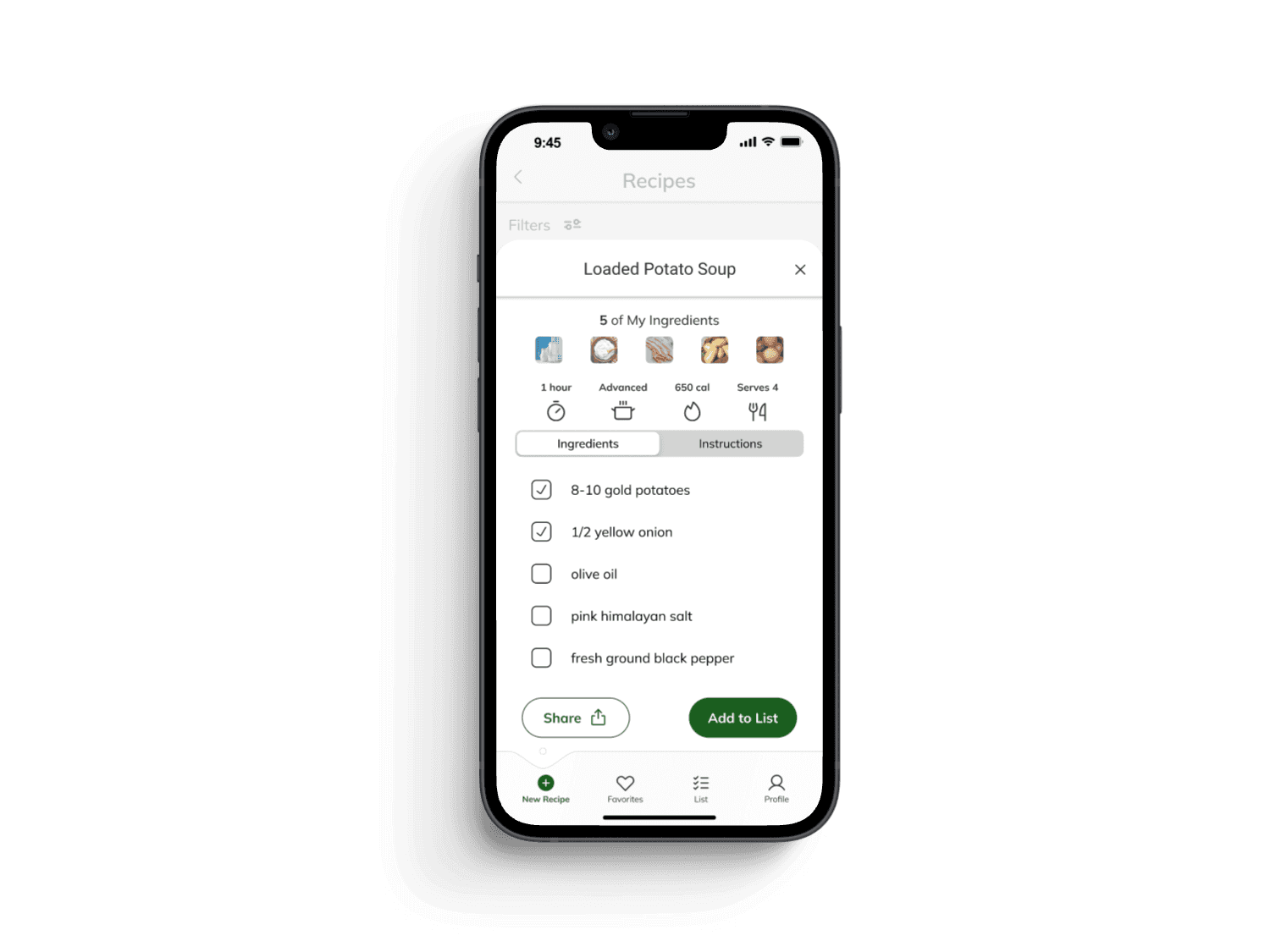
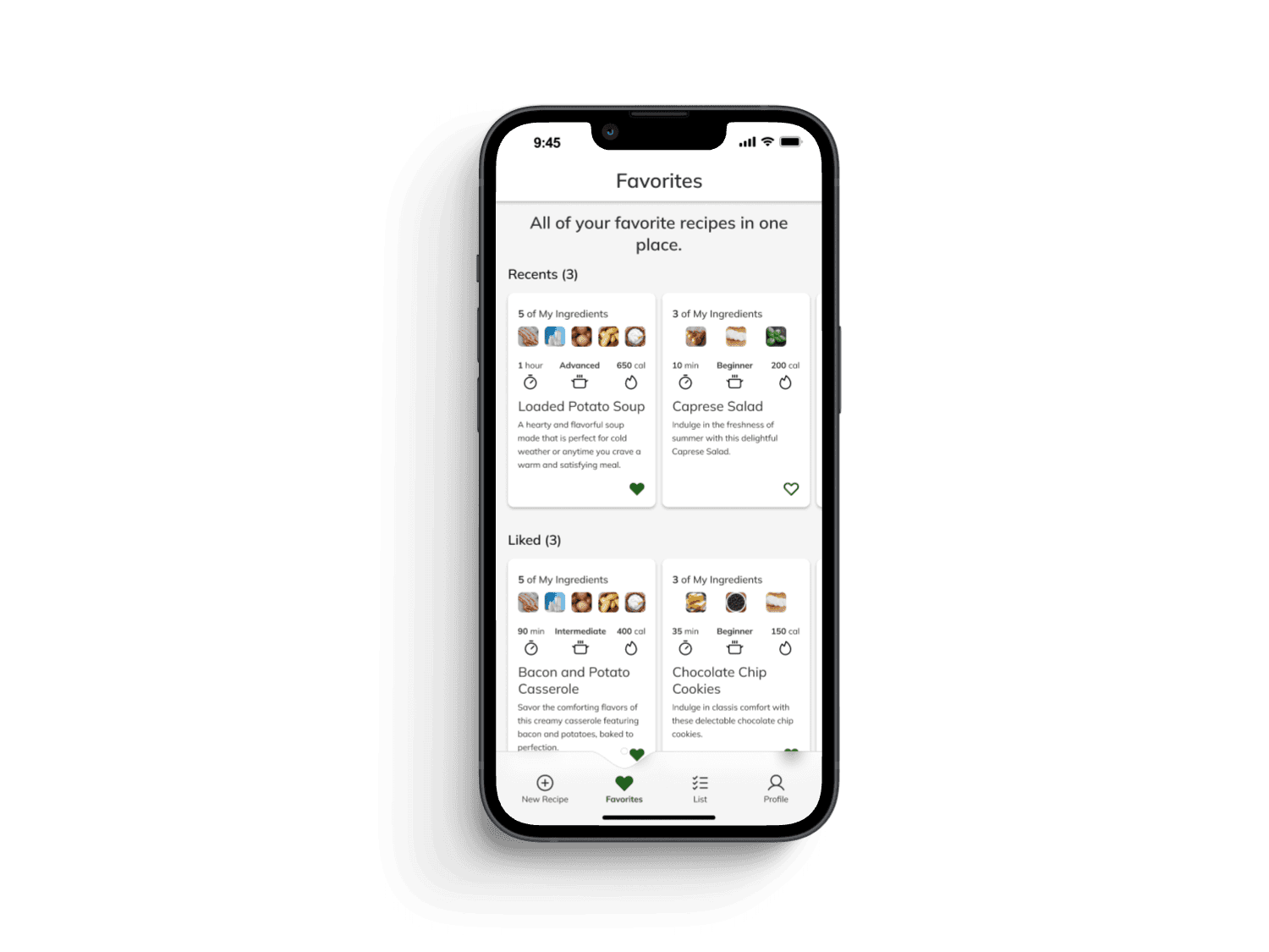
I tackled this problem by interviewing people at a local 10k to understand what information people prioritize when deciding what recipe to cook.
Preparation Time
Difficulty Level
Calorie Count
Visual Design:
I created a style guide to ensure consistency and intentionality behind each visual design decision.
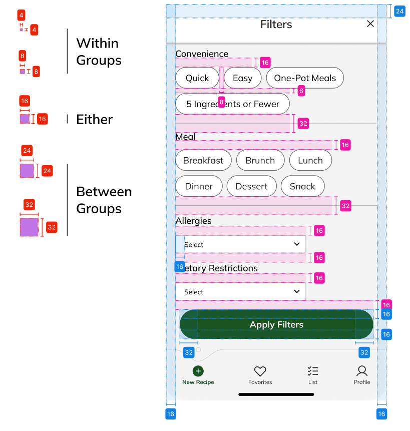
Final designs follow an eight-point grid with consistent spacing rules throughout.
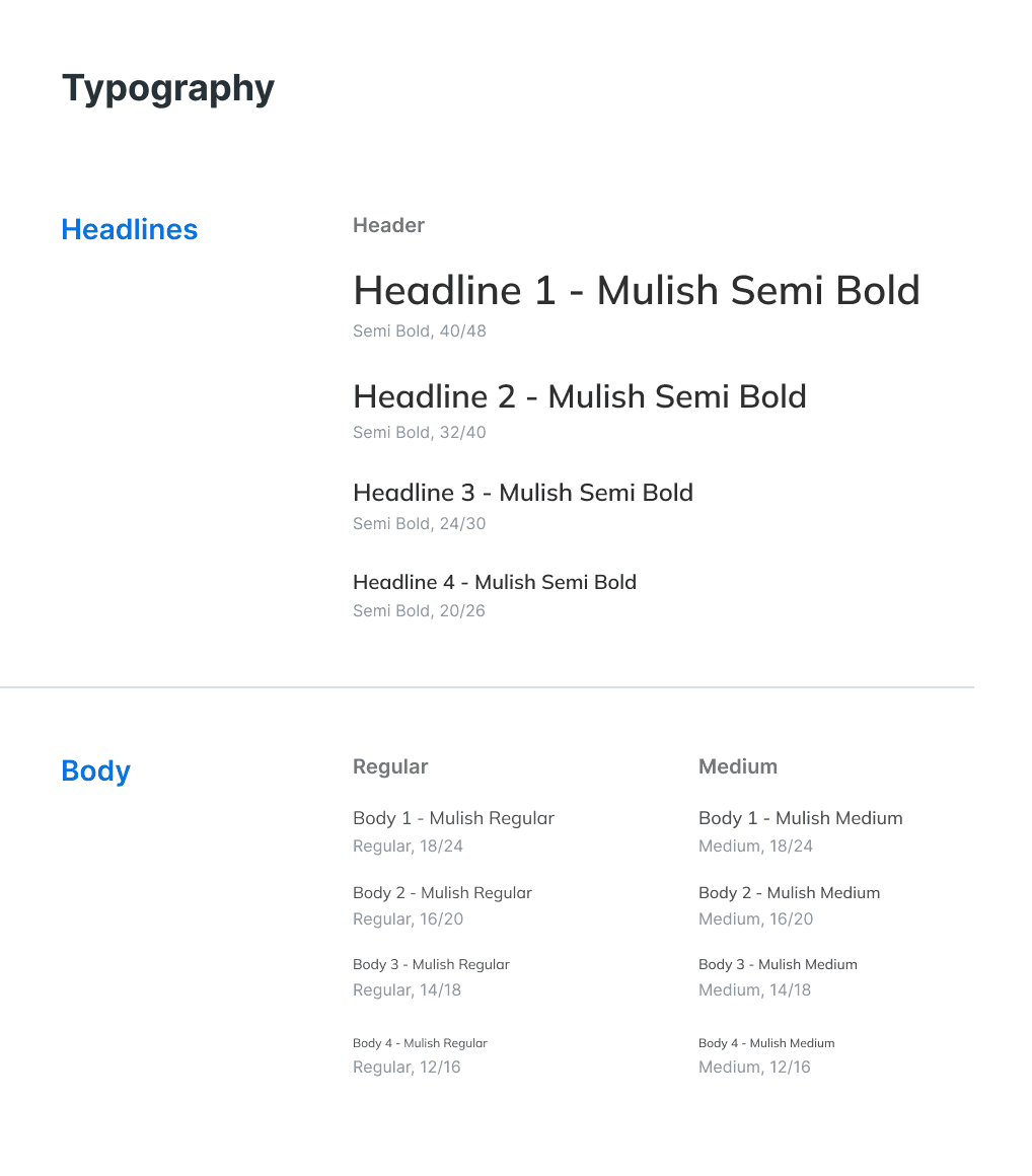
Typography guidelines inform hierarchy, clarity, and cohesion.
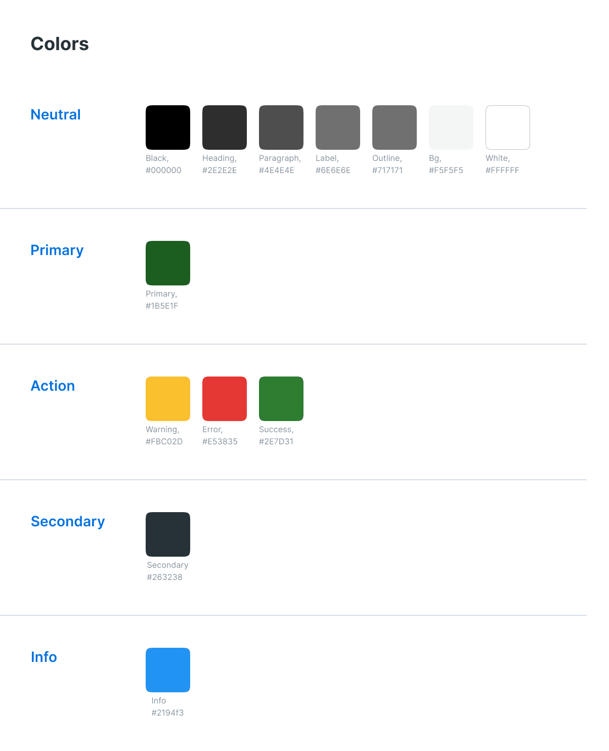
The color palette ensures clear, specific uses for each color.
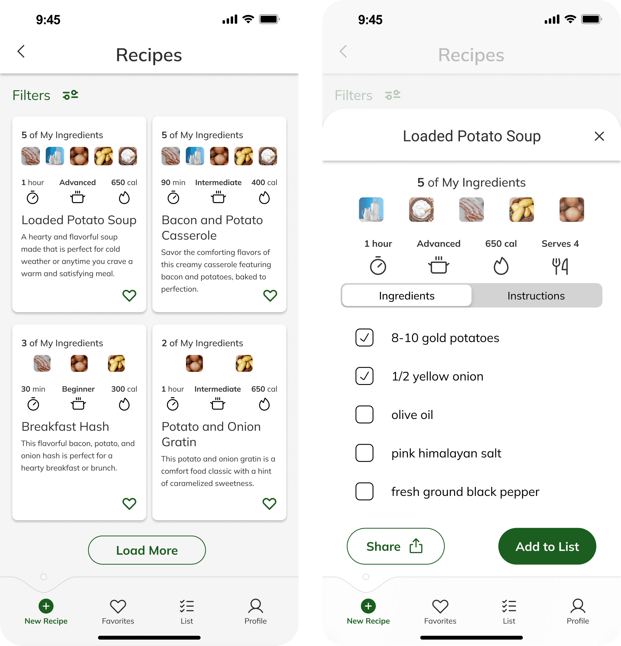
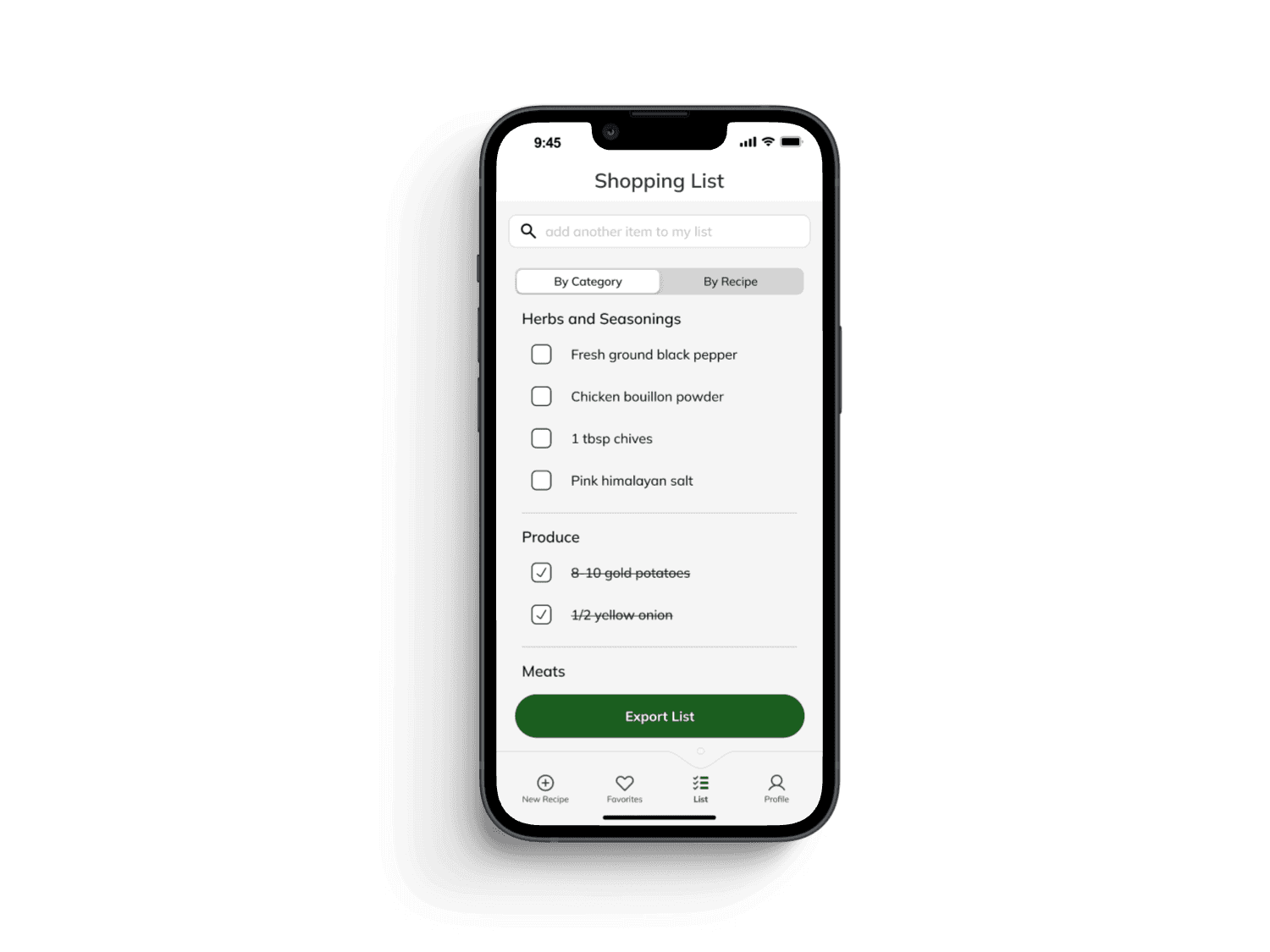
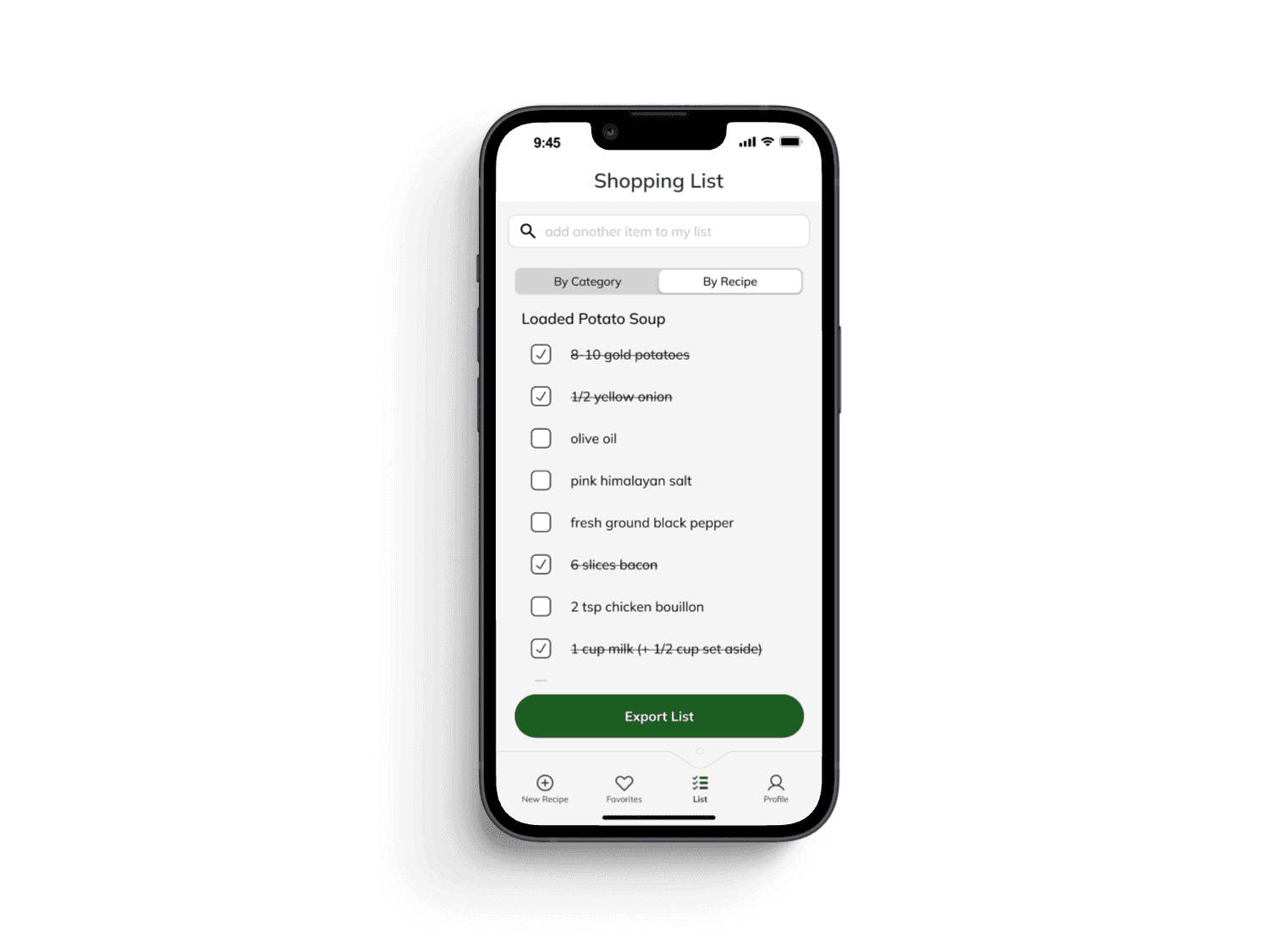
Final Designs:
“I would definitely use this. I've been wanting something like this to exist for years.”
-Ano Nymous (Usability Test Participant)
Conclusion
The Recip.AI app redesign successfully addressed existing usability issues, resulting in a more intuitive and user-friendly experience. The improved designs resulted in the following changes for KPIs:
Conversion rate increased from 27% to 72%, a 166% improvement.
Total cycle time decreased from an average of 2:25 to 1:05, reducing completion time by 55%.
Average satisfaction scores increased from 49% to 88%, a 79.6% improvement.
While I'm proud of these improvements, there is always room to grow, and if I were to do this project over, there are a few things I'd do differently:
Talk to users sooner. I didn't understand why the original pantry design was confusing participants. Talking with prospective users to better understand their processes for planning and preparing meals likely would have led me right to the issue.
Be more critical of competitors. I was originally enamored with aspects of competing products that I saw as robust features; however, looking back, these features were designed to solve different problems and were counterproductive Recip.AI's goals.
Acknowledging the impact of constraints. If I had the opportunity, I would use additional testing methods to understand issues I didn't attempt to solve in this project. One issue participants shared was a lack of trust in AI. Some also shared doubts about the quality of AI-generated recipes. Determining how to increase confidence related to these issues would certainly have strengthened this project.
Thank you for taking the time to read this case study!
