
Process: Discover, Define, Develop, Deliver
Discover:
Initial Research:
User Interviews
Define:
Using data from the survey and interviews as a starting point, we refined our understanding of the problem by creating affinity diagrams and feature prioritization matrices.
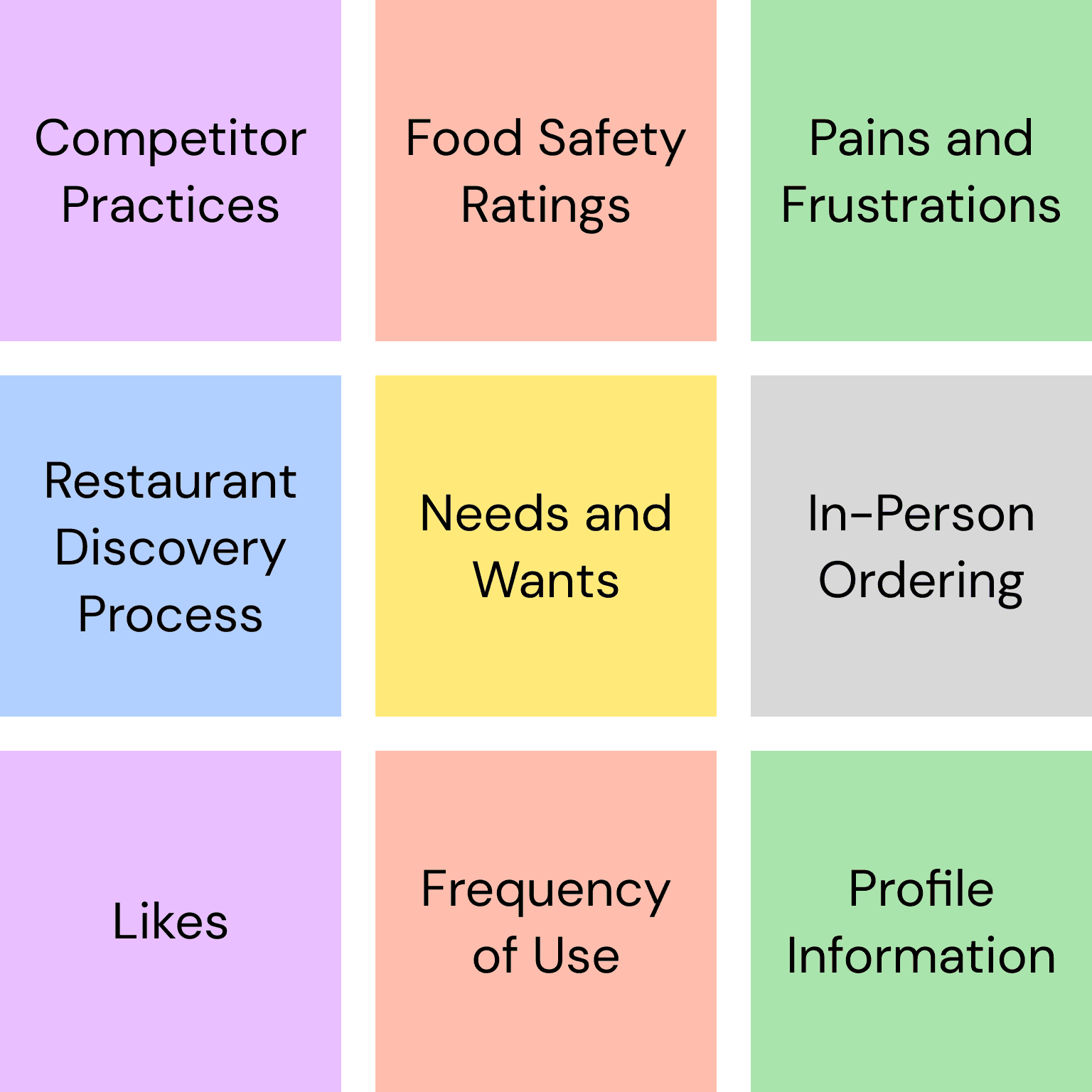
Affinity Diagram
Rather than having you squint to read hundreds of tiny post-its, here are the grouping categories we used.
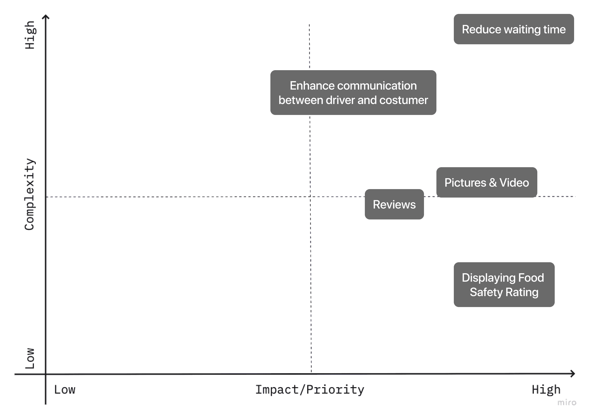
Feature Prioritization Matrix
We prioritized frequently occurring wants, needs, and pain-points with a high impact-to-complexity ratio.
Problem statement:
Uber Eats users ordering from a new restaurant for the first time need a convenient way to learn more about the quality and safety of food so that they can order with confidence.
We conducted a pre-test to establish some baseline KPIs and observe how users currently use the app.
5 participants
Remote, moderated tests
User satisfaction ratings

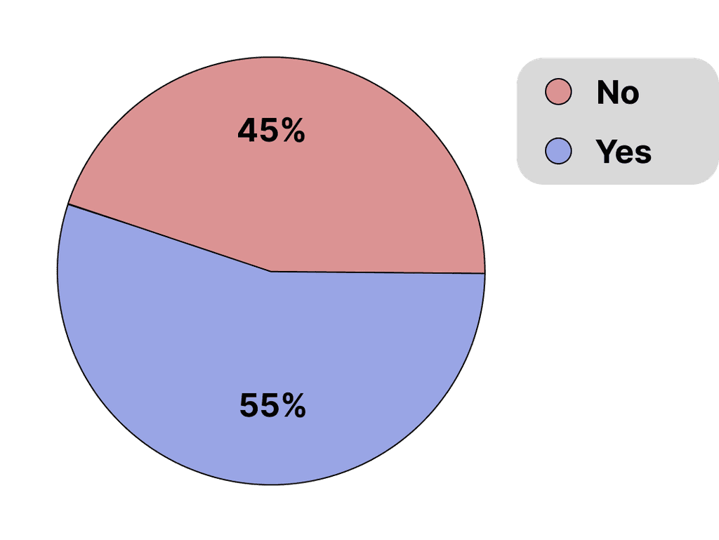
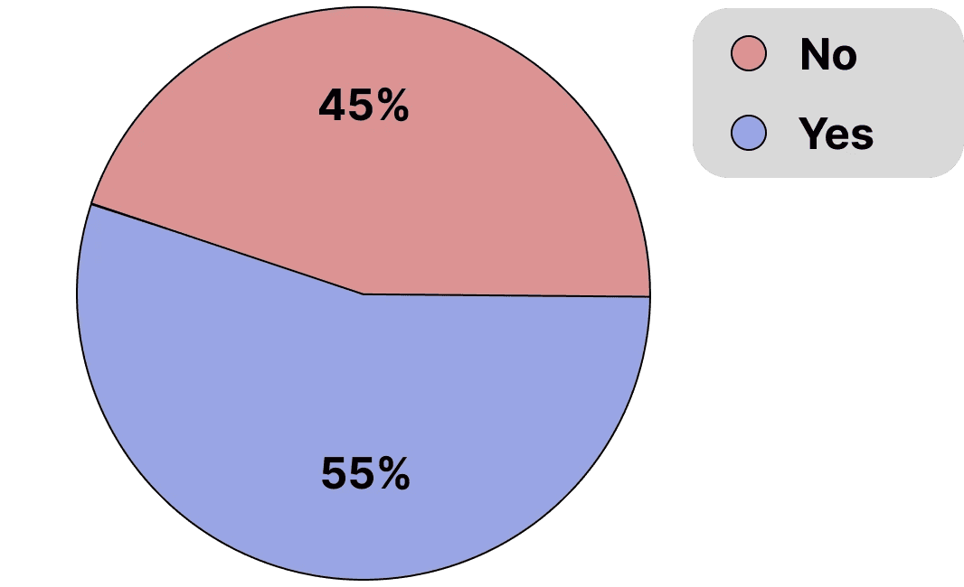
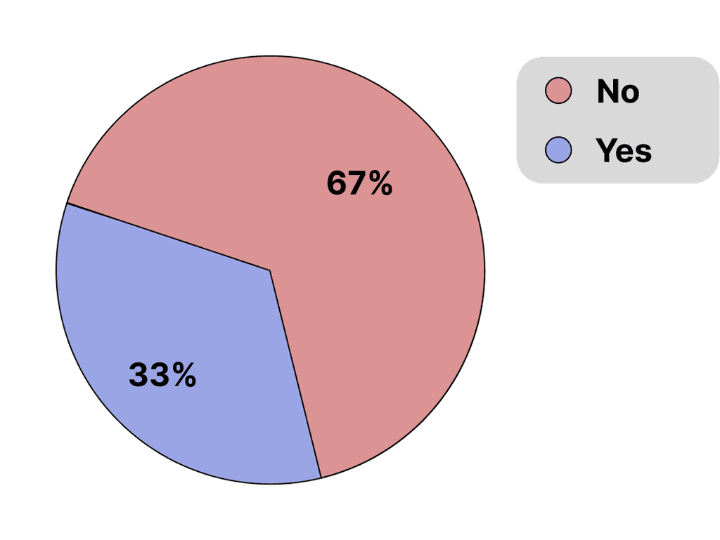
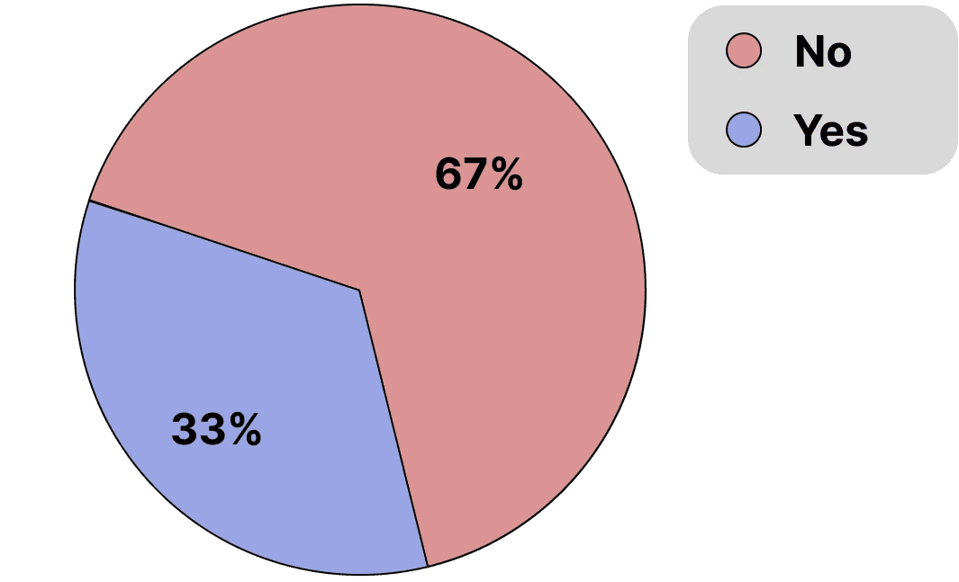
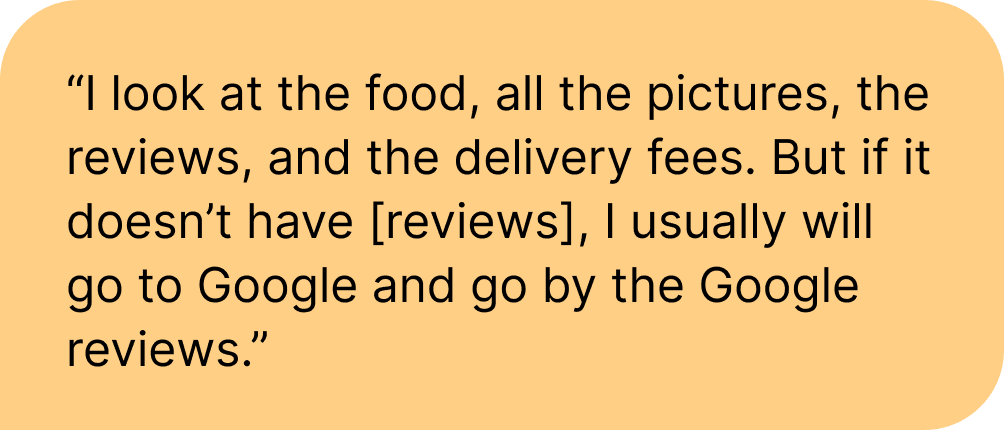
3 out of 5 participants left the Uber Eats app to look for additional information in Yelp or Google Maps.
Key findings:
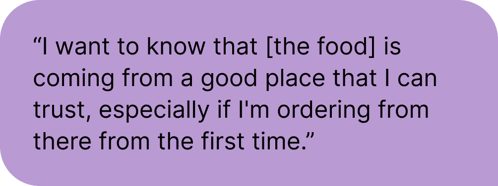
Users who looked at alternative sources (such as Yelp and Google Maps) were 23% more confident in both the safety and quality of food.
Users who consulted external sources were also 10% more likely to place an order.
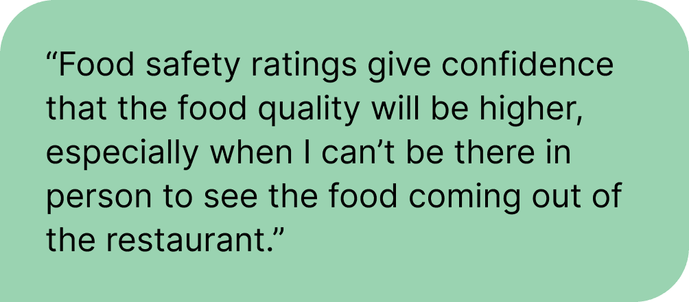
Users rely heavily on images of food, written reviews, and star ratings to determine food safety and quality.
"I can't click into this to read more about the reviews, so I don't know what their rating system is. I don't know what the metrics they're using are, and I just feel like it's really unreliable."
Develop:
During this stage of the process, I contributed through:
Crazy Eights brainstorming sketches
Defining user flows
Creating low-fidelity, mid-fidelity, and high-fidelity wireframes and prototypes
Conducted multiple rounds of user testing
Synthesizing user feedback and iterating based on findings
Here's a glance at some of the things I worked on:
Crazy Eights Brainstorm Sketches
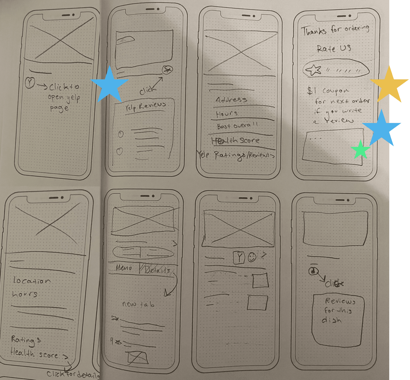
In eight minutes, I created eight sketches for potential solutions in a group brainstorming session. We each presented our ideas and starred features from each other's designs to incorporate into initial wireframes.
Features from my sketches that were selected included:
The option to view user-written reviews by clicking on ratings. (Multiple users tried to do this during pre-testing.)
A review modal that allows users to quickly review restaurants they've recently ordered from for an incentive.
Creating Low-Fidelity Versions of Existing Screens
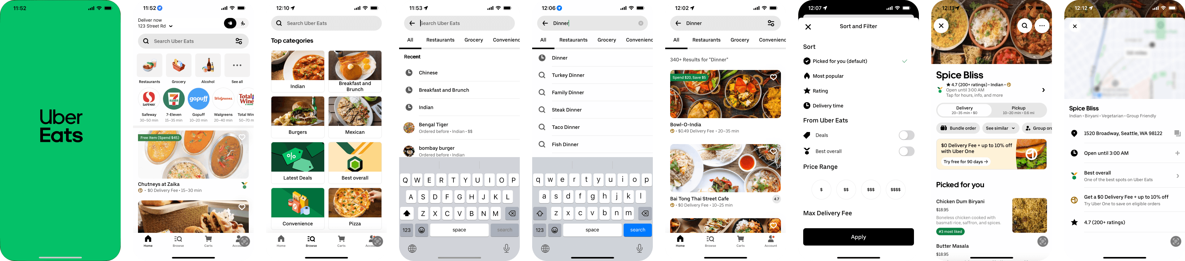
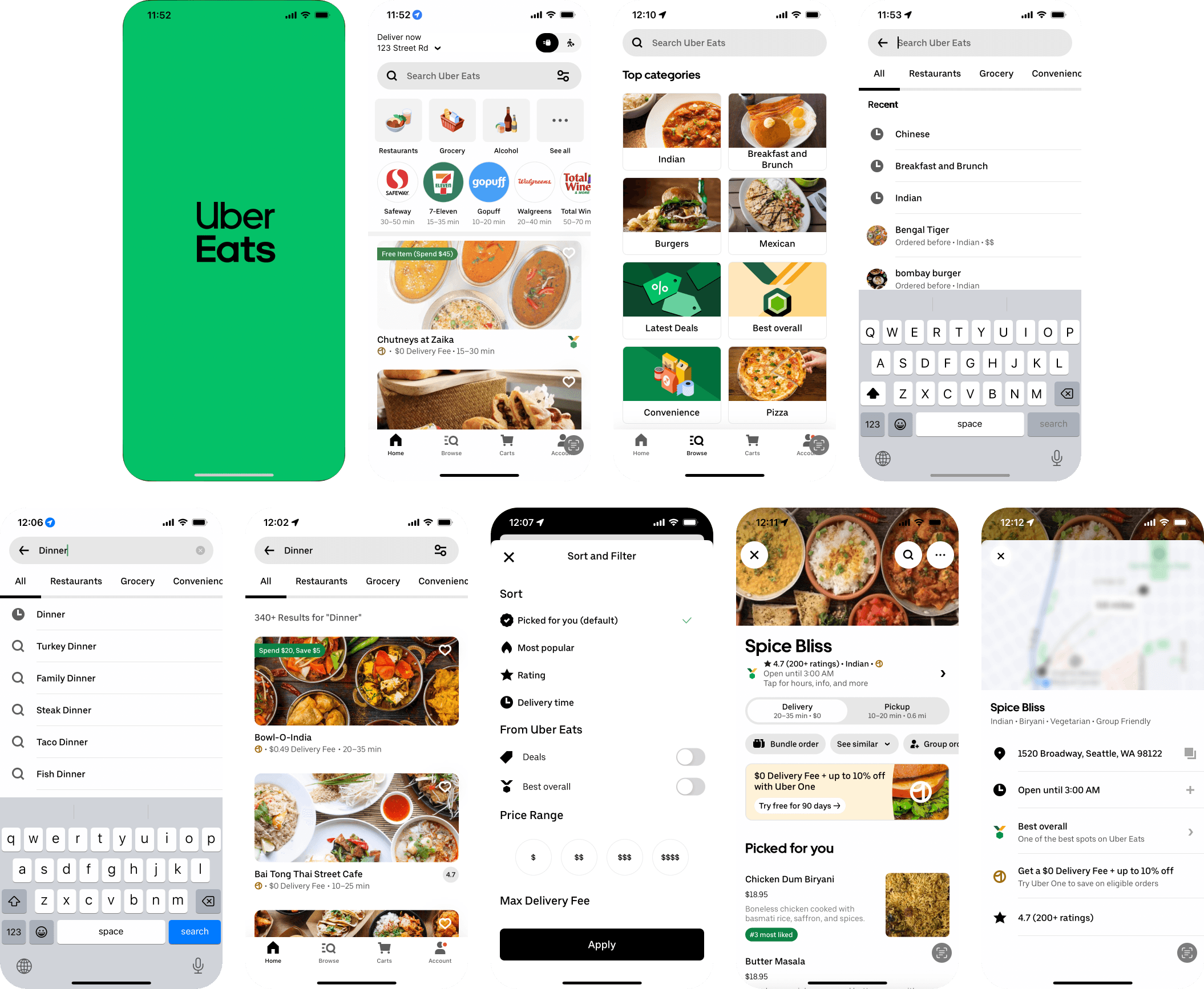
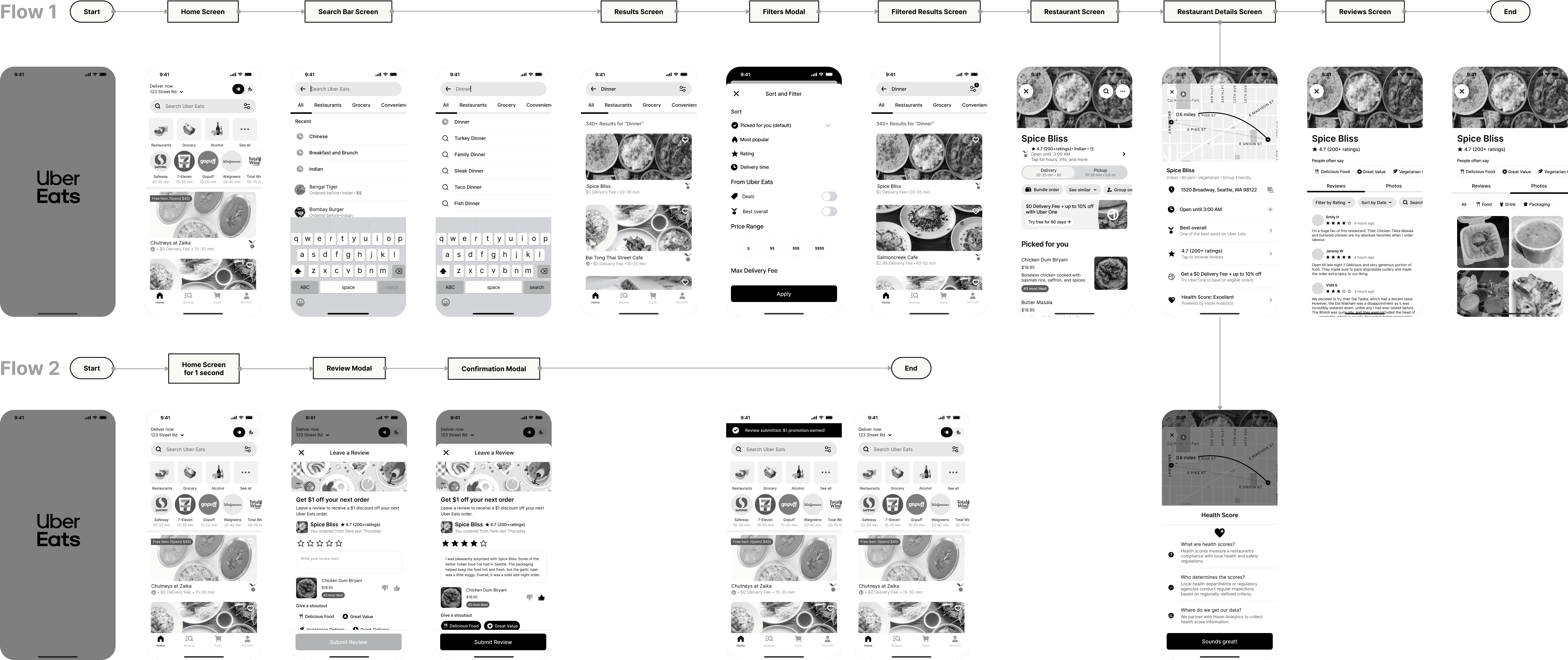
I selected initial screenshots from the Uber Eats app to incorporate into our user flow based on screens users visited during the pre-test (personal details obscured or altered for privacy).
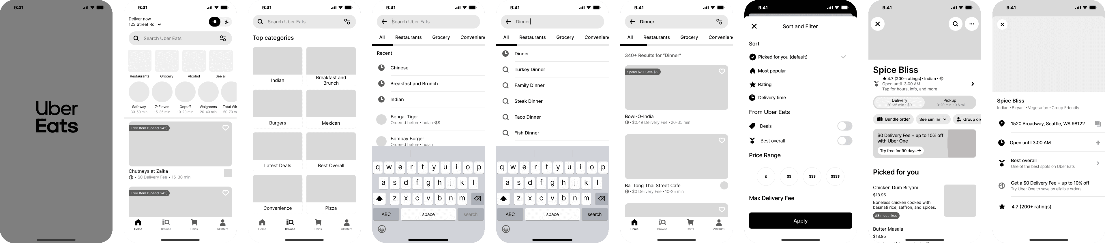
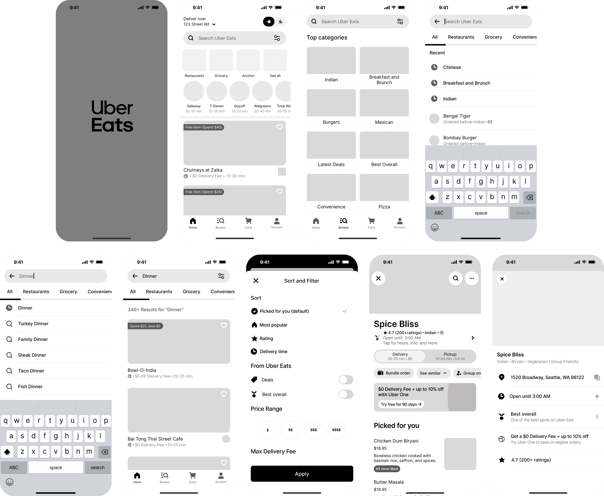
Using initial screenshots and Uber's Base design system as reference points, I made pixel-perfect low-fidelity wireframes to make it easy to modify existing designs to accommodate changes. This process also helped define visual design guidelines for the new screens we created.
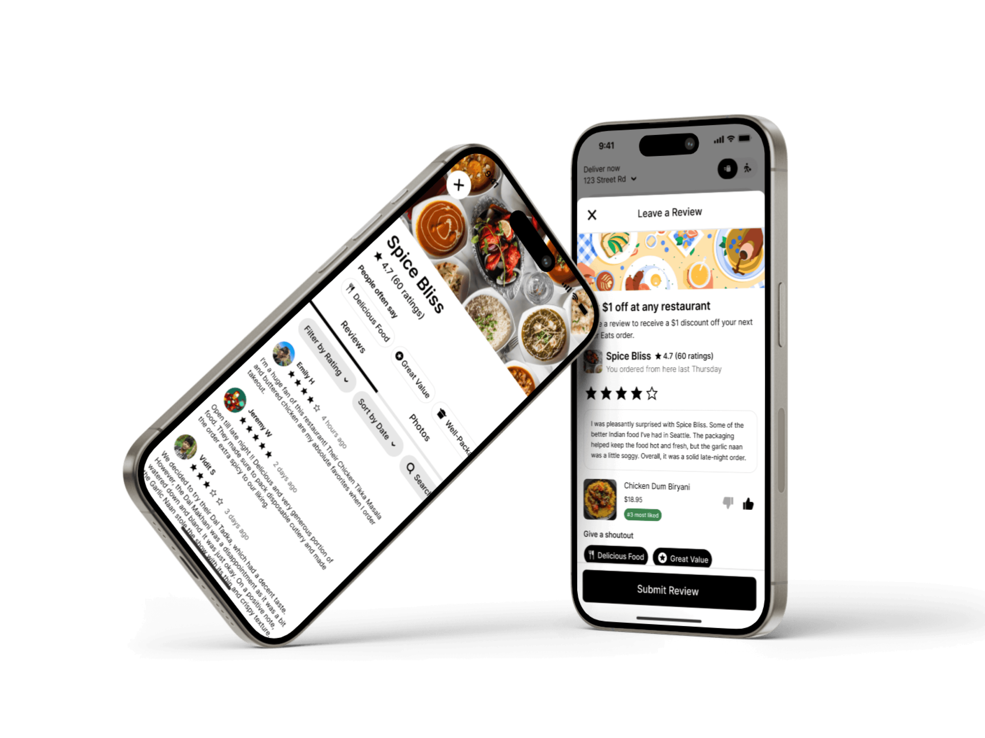
Creating New Screens for the Low-Fidelity Prototype
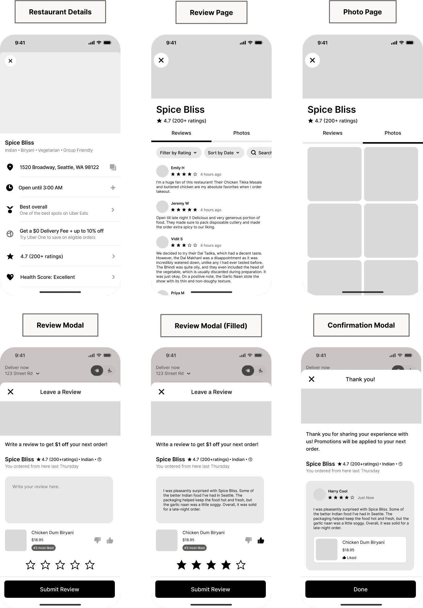
Using ideas from group brainstorming sessions, I created four new screens and altered one existing screen (two screens created with assistance from a team member).
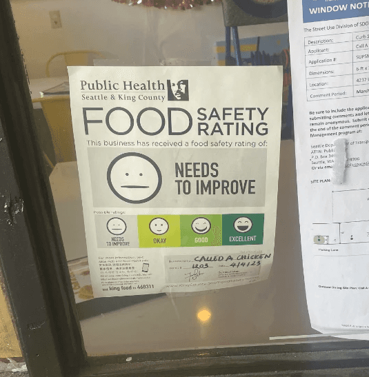
Restaurant Details: Modified to allow users to view rating details and include a health score category based on local health rating systems.
Review Page: Showcase user reviews within the Uber Eats app to decrease drop-off rates due to visiting competing sites with reviews.
Photo Page: Allows users to view user-uploaded food photos from a restaurant.
Review Modal: Users can leave reviews of restaurants they've ordered from the next time they open the app. Features a star rating, individual menu item rating, and written review.
Confirmation Modal: Confirmation of submission of user's review and application of promotion. Provides a preview of what the review will look like to others.
Testing the Low-Fidelity Prototype

During the initial round of usability testing, we found several areas of confusion, as well as indications that we were moving in the right direction. I contributed to revisions by:
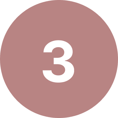
Creating a detailed health-score information page
Increasing the size of hotspots to reduce error rates
Changing microcopy hierarchy and content to emphasize the promotional offer
I used existing detail screens in Uber Eats as a basis for the designs of the Health Score Details page, including creating icons that mimic the style of Uber Base icons. The design also utilizes a sample source (Hazel Analytics, a company that partners with competitor Yelp to provide this information) to demonstrate how information could be collected.
Create Mid-fidelity Wireframes
After incorporating feedback from the initial round of testing, I developed a mid-fidelity prototype and conducted another round of testing to assess whether the iterations addressed the issues identified by users.
Mid-Fidelity Testing and Iterations
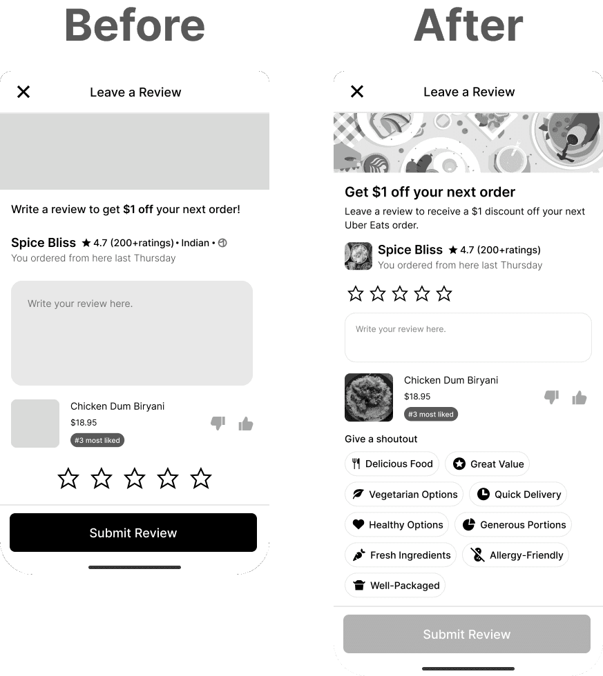
The additional round of testing revealed that users who didn't have a strong feeling about a restaurant were less likely to leave a review.
To make the review-writing process more convenient, I added a new section to the review page that allows users to select from pre-populated shoutouts.
This resulted in many more users expressing a desire to leave reviews.
Conclusion
Thank you for taking the time to read this case study!