Journey Mapping
Usability Testing
Prototyping
Uber Eats Feature Design (Conceptual)
Mobile app feature designed to improve confidence in food quality and safety while reducing drop-offs during restaurant exploration.
Role
UX Designer
Timeline
September - October 2023 (4 weeks)
Team
Josiah Navarro, Bhargavi Marathe, Stephen Potes, Chris Chow (UX Designers)
Project Brief
Uber Eats enables global users to order delivery from local restaurants conveniently. However, users seeking to learn more about restaurants with few ratings often leave the app in search of more detailed information. Our aim was to empower users to make informed decisions within the app when selecting a restaurant for delivery.
Uber Eats enables global users to order delivery from local restaurants conveniently. However, users seeking to learn more about restaurants with few ratings often leave the app in search of more detailed information. Our aim was to empower users to make informed decisions within the app when selecting a restaurant for delivery.
Uber Eats enables global users to order delivery from local restaurants conveniently. However, users seeking to learn more about restaurants with few ratings often leave the app in search of more detailed information. Our aim was to empower users to make informed decisions within the app when selecting a restaurant for delivery.
My Primary Contributions
Creating low-fidelity, mid-fidelity, and high-fidelity prototypes
Conducting user interviews and testing
Project management
Leading ideation activities
Initial concept
Results
The project resulted in improved user confidence in food safety and higher satisfaction with the restaurant discovery experience. This led to increased likeliness of ordering from a restaurant. While further research is needed, increased satisfaction with restaurant information could correlate with lower drop-off rates.
The project resulted in improved user confidence in food safety and higher satisfaction with the restaurant discovery experience. This led to increased likeliness of ordering from a restaurant. While further research is needed, increased satisfaction with restaurant information could correlate with lower drop-off rates.
The project resulted in improved user confidence in food safety and higher satisfaction with the restaurant discovery experience. This led to increased likeliness of ordering from a restaurant. While further research is needed, increased satisfaction with restaurant information could correlate with lower drop-off rates.
Problem Exploration
This project was initially inspired by a burrito run to one of my favorite local Mexican restaurants. I was going to order delivery but instead opted to pick up the food myself. When I arrived, the food safety rating made me lose my appetite. This brought about a concerning realization: had I decided to order online, I wouldn't have known that the restaurant had failed a health inspection. This got me thinking, "What other discrepancies between online and in-person ordering processes affect users' confidence in the safety and quality of their food?"
This project was initially inspired by a burrito run to one of my favorite local Mexican restaurants. I was going to order delivery but instead opted to pick up the food myself. When I arrived, the food safety rating made me lose my appetite. This brought about a concerning realization: had I decided to order online, I wouldn't have known that the restaurant had failed a health inspection. This got me thinking, "What other discrepancies between online and in-person ordering processes affect users' confidence in the safety and quality of their food?"
This project was initially inspired by a burrito run to one of my favorite local Mexican restaurants. I was going to order delivery but instead opted to pick up the food myself. When I arrived, the food safety rating made me lose my appetite. This brought about a concerning realization: had I decided to order online, I wouldn't have known that the restaurant had failed a health inspection. This got me thinking, "What other discrepancies between online and in-person ordering processes affect users' confidence in the safety and quality of their food?"
Would you order takeout from this restaurant?

How about this one?

These are two different views of the same restaurant!
Initial Research
Our team surveyed 18 participants and interviewed 6 participants to learn about users' ordering processes, the extent to which they value health information, and what they look for when deciding where to order from.
Initial Research
Our team surveyed 18 participants and interviewed 6 participants to learn about users' ordering processes, the extent to which they value health information, and what they look for when deciding where to order from.
Initial Research
Our team surveyed 18 participants and interviewed 6 participants to learn about users' ordering processes, the extent to which they value health information, and what they look for when deciding where to order from.


Key Takeaways
Over half of the participants experienced a food-borne illness after dining at a restaurant or ordering takeout.
One in three participants was aware of food safety ratings in place in their area.
Over half of participants had an experience where food safety information influenced their decision to order from a restaurant.
Prioritization
We refined our understanding of the problem by creating affinity diagrams and feature prioritization matrices.
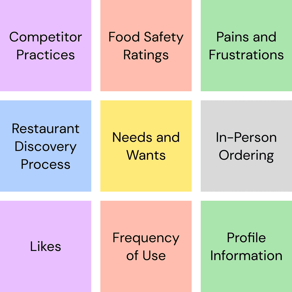
Rather than having you squint to read hundreds of tiny post-its, here are the grouping categories we used.
Rather than having you squint to read hundreds of tiny post-its, here are the grouping categories we used.
Rather than having you squint to read hundreds of tiny post-its, here are the grouping categories we used.
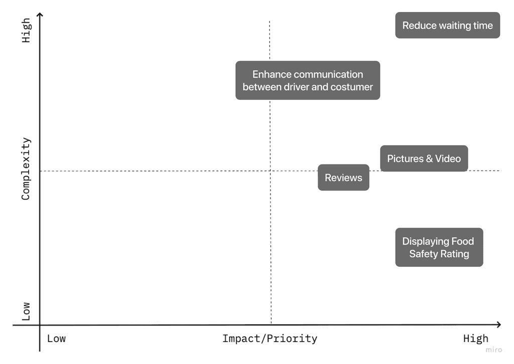
We prioritized frequently occurring wants, needs, and pain-points with a high impact-to-complexity ratio.
We prioritized frequently occurring wants, needs, and pain-points with a high impact-to-complexity ratio.
We prioritized frequently occurring wants, needs, and pain-points with a high impact-to-complexity ratio.
Problem Statement
Seattle-based Uber Eats users ordering from a new restaurant for the first time need a convenient way to learn more about the quality and safety of food so that they can order with confidence.
Learning from Outside-App Journeys
We conducted a pre-test to establish some baseline KPIs and observe how users currently use the app.
During restaurant evaluation, 3 out of 5 participants left the Uber Eats app to look for additional information in Yelp or Google Maps. External information introduces competition through calls-to-action and leads to increased drop-off rates.

Key Findings
Users who looked at alternative sources (such as Yelp and Google Maps) were 23% more confident in both the safety and quality of food.
Users who consulted external sources were also 10% more likely to place an order.
Users rely heavily on images of food, written reviews, and star ratings to determine food safety and quality.
"I can't click into this to read more about the reviews, so I don't know what their rating system is. I don't know what the metrics they're using are, and I just feel like it's really unreliable."
How might we provide the information users search for in external sources within the Uber Eats ordering process?
Crazy Eights
In eight minutes, I created eight sketches for potential solutions in a group brainstorming session. We each presented our ideas and starred features from each other's designs to incorporate into initial wireframes.
Features from my sketches that were selected included:
The option to view user-written reviews by clicking on ratings. (Multiple users tried to do this during pre-testing.)
A review modal that allows users to quickly review restaurants they've recently ordered from for an incentive.
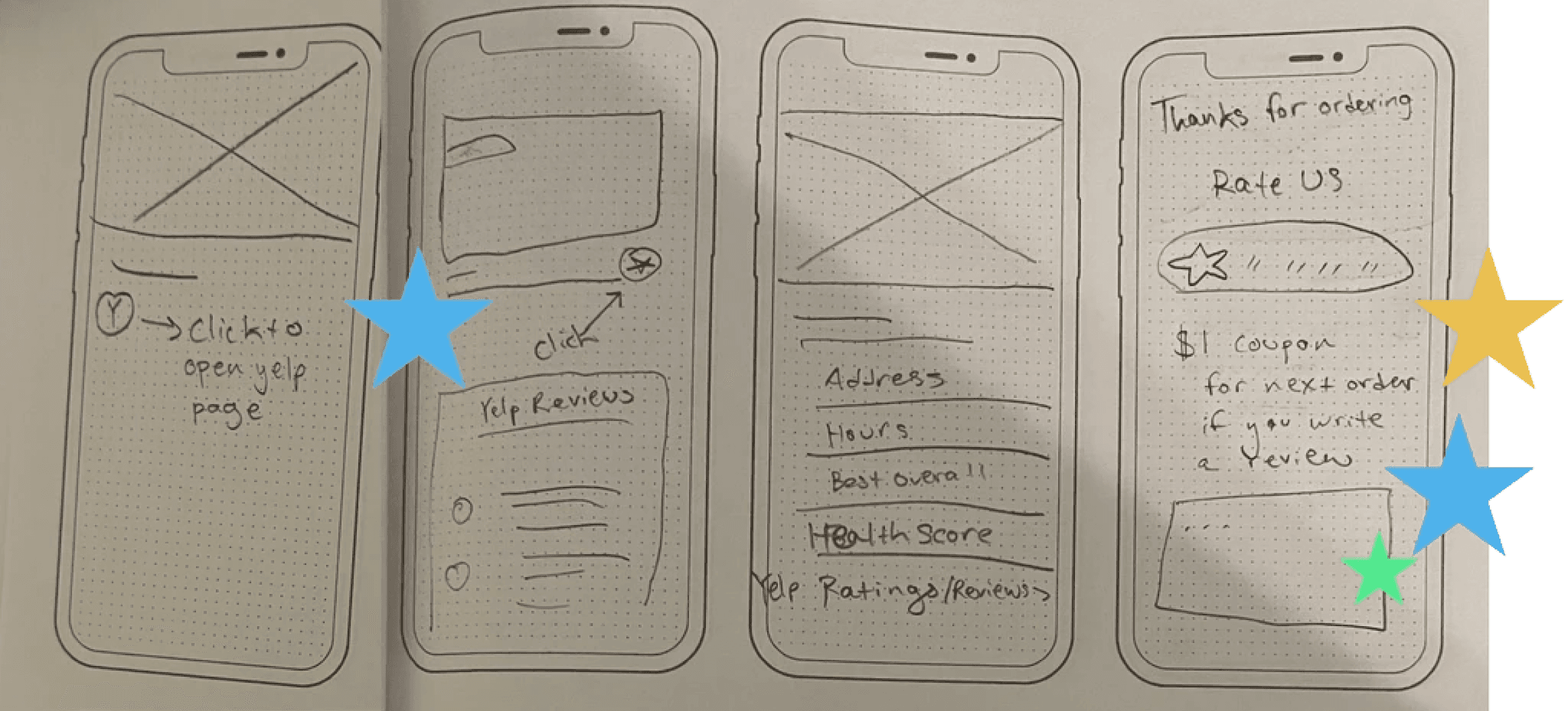
New Screens for the Low-Fidelity Prototype
Using ideas from group brainstorming sessions, I created four new screens and altered one existing screen (two screens created with assistance from a team member).
Using ideas from group brainstorming sessions, I created four new screens and altered one existing screen (two screens created with assistance from a team member).
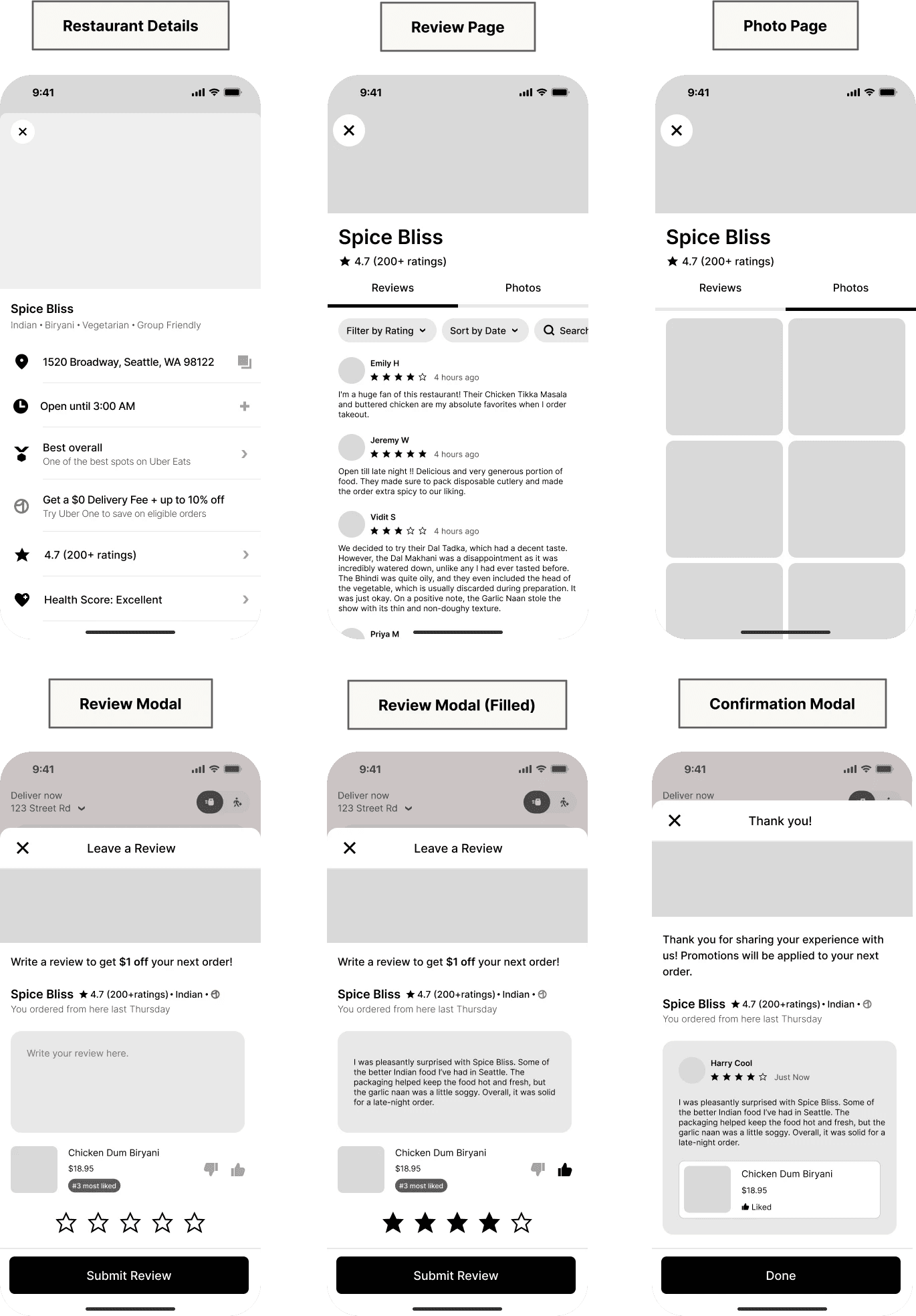
Restaurant Details: Modified to allow users to view rating details and include a health score category based on local health rating systems.
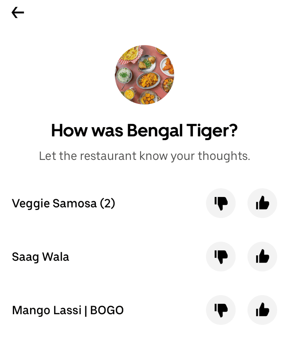
Review Page: Showcase user reviews within the Uber Eats app to decrease drop-off rates due to visiting competing sites with reviews.
Photo Page: Allows users to view user-uploaded food photos from a restaurant.
Review Modal: Users can leave reviews of restaurants they've ordered from the next time they open the app. Features a star rating, individual menu item rating, and written review.
Confirmation Modal: Confirmation of submission of user's review and application of promotion. Provides a preview of what the review will look like to others.
Restaurant Details: Modified to allow users to view rating details and include a health score category based on local health rating systems.
Review Page: Showcase user reviews within the Uber Eats app to decrease drop-off rates due to visiting competing sites with reviews.
Photo Page: Allows users to view user-uploaded food photos from a restaurant.
Review Modal: Users can leave reviews of restaurants they've ordered from the next time they open the app. Features a star rating, individual menu item rating, and written review.
Confirmation Modal: Confirmation of submission of user's review and application of promotion. Provides a preview of what the review will look like to others.
Testing the Low-Fidelity Prototype
Clarity

3/5 users thought the Health Score needed clarification.
Navigation

4/5 participants struggled to find the restaurant details page.
Visibility

2/5 participants didn’t notice the promotional offer.
Concept Validation

All participants liked the idea of the review modal.
During the initial round of usability testing, we found several areas of confusion, as well as indications that we were moving in the right direction. I contributed to revisions by:
Creating a detailed health-score information page.
Increasing the size of hotspots to reduce error rates.
Changing microcopy hierarchy and content to emphasize the promotional offer.
During the initial round of usability testing, we found several areas of confusion, as well as indications that we were moving in the right direction. I contributed to revisions by:
Creating a detailed health-score information page.
Increasing the size of hotspots to reduce error rates.
Changing microcopy hierarchy and content to emphasize the promotional offer

I used existing detail screens in Uber Eats as a basis for the designs of the Health Score Details page, including creating icons that mimic the style of Uber Base icons. The design also utilizes a sample source (Hazel Analytics, a company that partners with competitor Yelp to provide this information) to demonstrate how information could be collected.
I used existing detail screens in Uber Eats as a basis for the designs of the Health Score Details page, including creating icons that mimic the style of Uber Base icons. The design also utilizes a sample source (Hazel Analytics, a company that partners with competitor Yelp to provide this information) to demonstrate how information could be collected.
I used existing detail screens in Uber Eats as a basis for the designs of the Health Score Details page, including creating icons that mimic the style of Uber Base icons. The design also utilizes a sample source (Hazel Analytics, a company that partners with competitor Yelp to provide this information) to demonstrate how information could be collected.
Creating Mid-Fidelity Wireframes
After incorporating feedback from the initial round of testing, I developed a mid-fidelity prototype and conducted another round of testing to assess whether the iterations addressed the issues identified by users.

Mid-Fidelity Testing and Iterations

The additional round of testing revealed that users who didn't have a strong feeling about a restaurant were less likely to leave a review.
To make the review-writing process more convenient, I added a new section to the review page that allows users to select from pre-populated shoutouts.
This resulted in many more users expressing a desire to leave reviews.
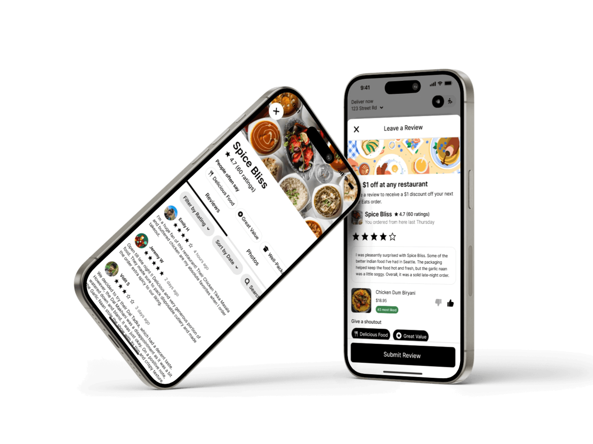
Key Features from Final Designs
Health score information allows users to quickly build trust in the safety of a restaurant's food.
Browsing user-written reviews allows users to see what others are saying about a restaurant so they can make informed decisions without leaving the app.
Leaving user-written reviews helps restaurants build reputations through shoutouts and empowers users to share their experiences.
Conclusion
This was a conceptual project, and I did not collaborate with Uber in any capacity. However, should this project be taken up in the future, I would revisit, clarify and provide documentation in the following areas:
Interaction details for when users click on images uploaded by other customers
Specifics regarding the user journey of leaving a review (timing, notifications, etc.)
Process for uploading user-generated images (our current design does not account this)
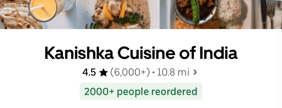
Uber has since made changes to their app, some of which align with our findings and suggestions.
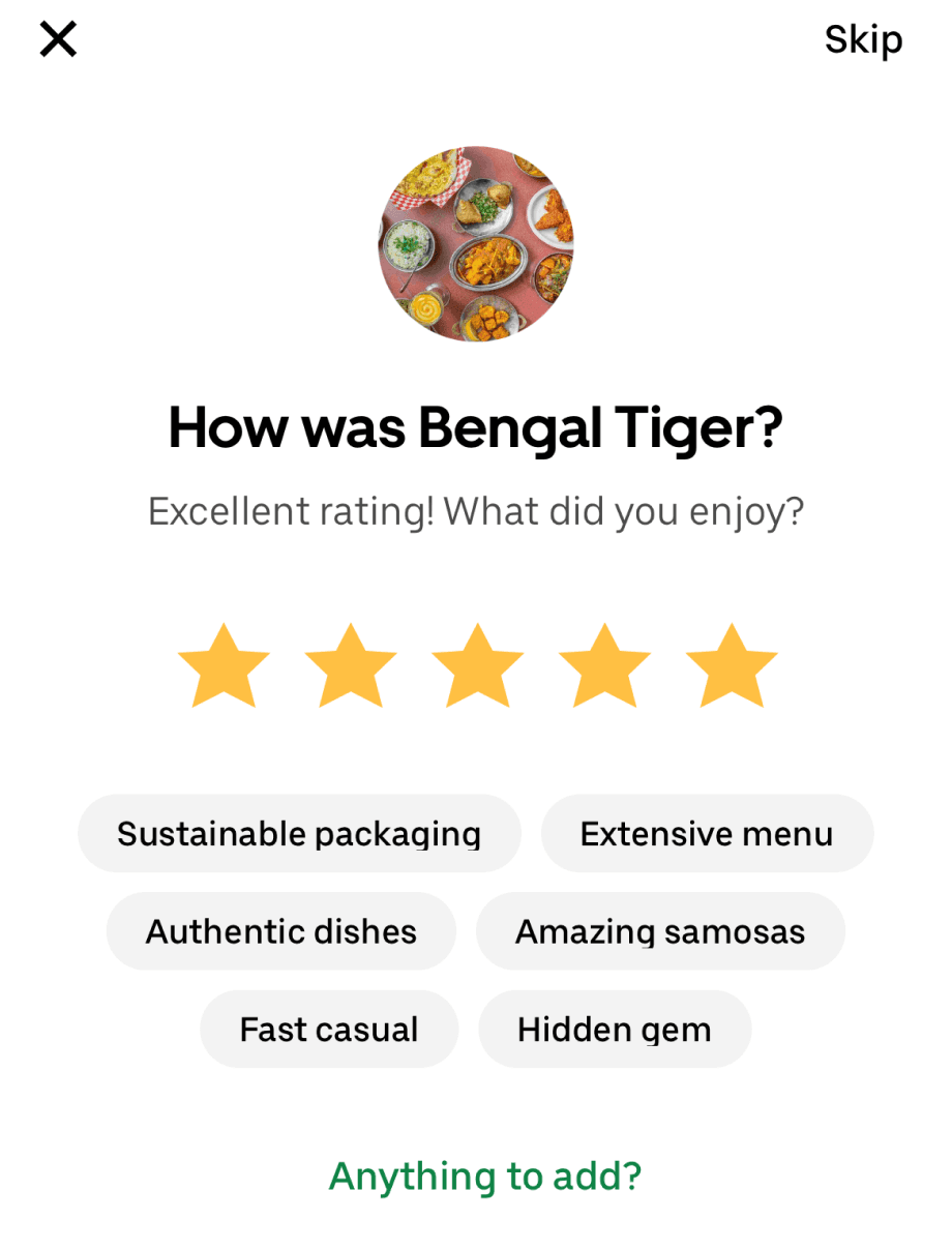
Review system for restaurants including smart shoutouts, star ratings, and written reviews.
Higher quantity of ratings.
Information about how many people re-ordered recently.
Option to like individual dishes.
I am especially curious how the Uber team encouraged users to leave more reviews.
Uber has since made changes to their app, some of which align with our findings and suggestions.
Review system for restaurants including smart shoutouts, star ratings, and written reviews.
Higher quantity of ratings.
Information about how many people re-ordered recently.
Option to like individual dishes.
I am especially curious how the Uber team encouraged users to leave more reviews.

What I learned:
Importance of having a clearly-defined user flow: Spending more time on establishing the user flow would have helped me identify all of the necessary screens from the original Uber Eats app. I would have wasted less time recreating unmodified screens from scratch.
Project management skills: Being in charge of project management (through Trello) helped our team establish transparent communication about deadlines for project milestones in a remote work environment.
Consider multiple user groups: Upon completing the project, I recognized that we only interviewed one group of users. We did not speak with restaurants using Uber Eats to understand how this feature would affect their business. To address this, I spoke with four managers at local restaurants in my area and received overwhelmingly positive initial support. However, I did not have the opportunity to speak with restaurants that received low health scores, and future iterations of this project should include these perspectives.
Key Features from Final Designs:
Health score information allows users to quickly build trust in the safety of a restaurant's food.
Browsing user-written reviews allows users to see what others are saying about a restaurant so they can make informed decisions without leaving the app.