UX Design
UX Research
Stakeholder Collaboration
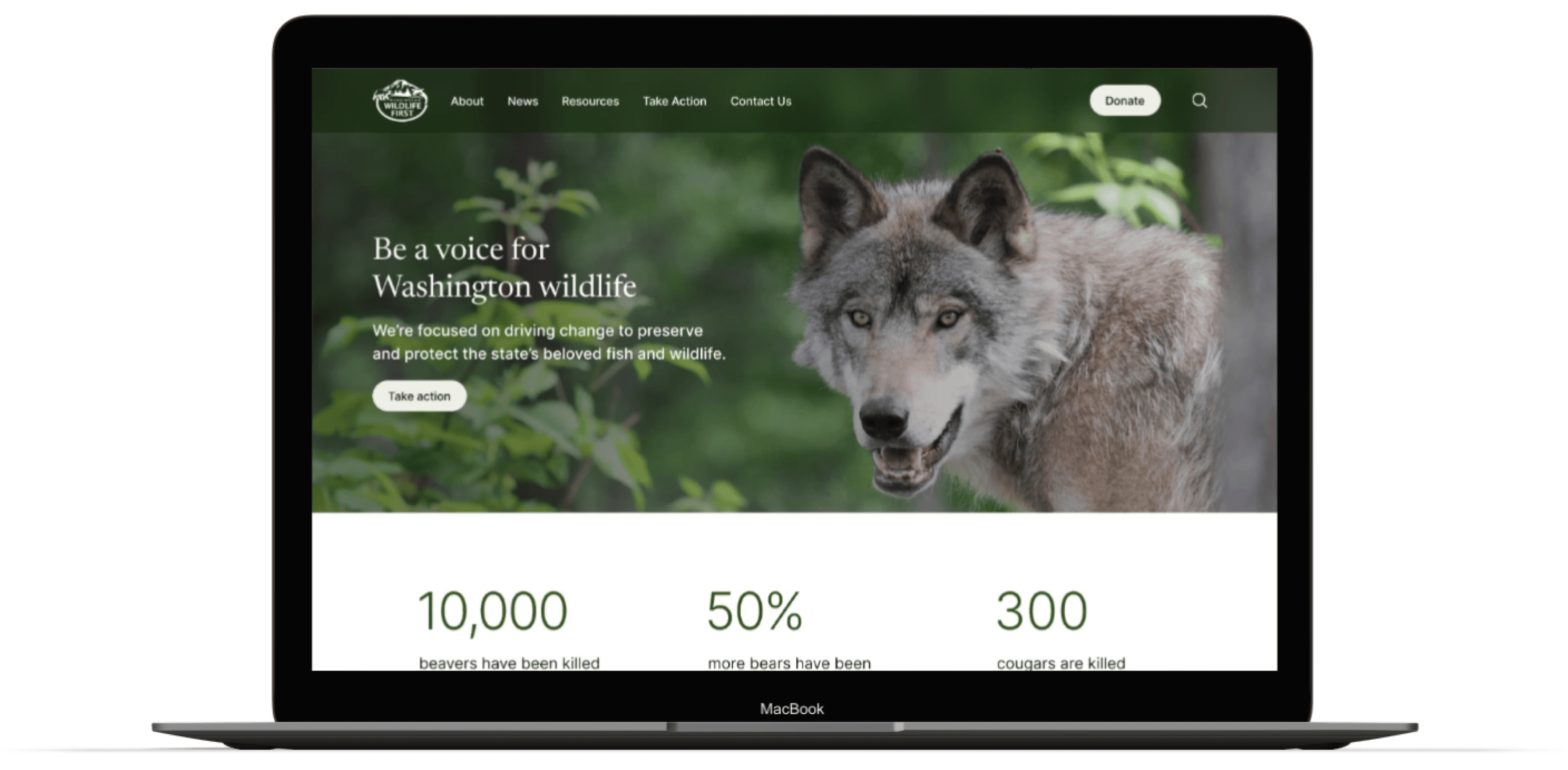
Washington Wildlife First Website Redesign
Website redesign to enhance brand resonance, increase donations, and improve first-time visitors' experiences.
Role
UX Designer
Timeline
July - August 2023 (3 Weeks)
Team
UX Design: Madeline Schroeder, Sweta Shah, Emily Cruz
Development: Roger Dunkelbarger
Project Brief
Our team was tasked with redesigning Washington Wildlife First's website to:

My Main Contributions
Taking the lead in creating a presentation to secure stakeholder buy-in.
Conducting user interviews
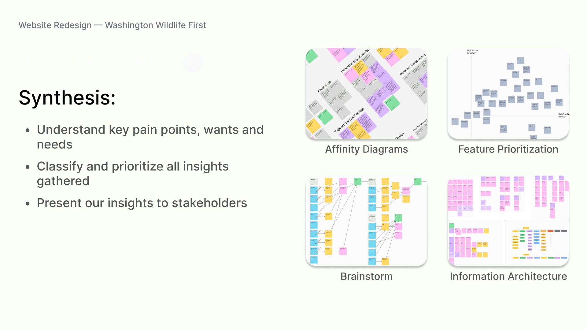
Analyzing results to identify insights through affinity diagrams.
Sketching mobile wireframes
Facilitating stakeholder and developer communication.
Creating a high-fidelity campaign page and several components that were used throughout the site.
Problem Exploration
Initial Research
User Interviews

Users need familiarity, specificity, and transparency before taking action.
Heuristic Evaluation

The website is text-heavy and has inconsistent visual design.
Competitor Analysis
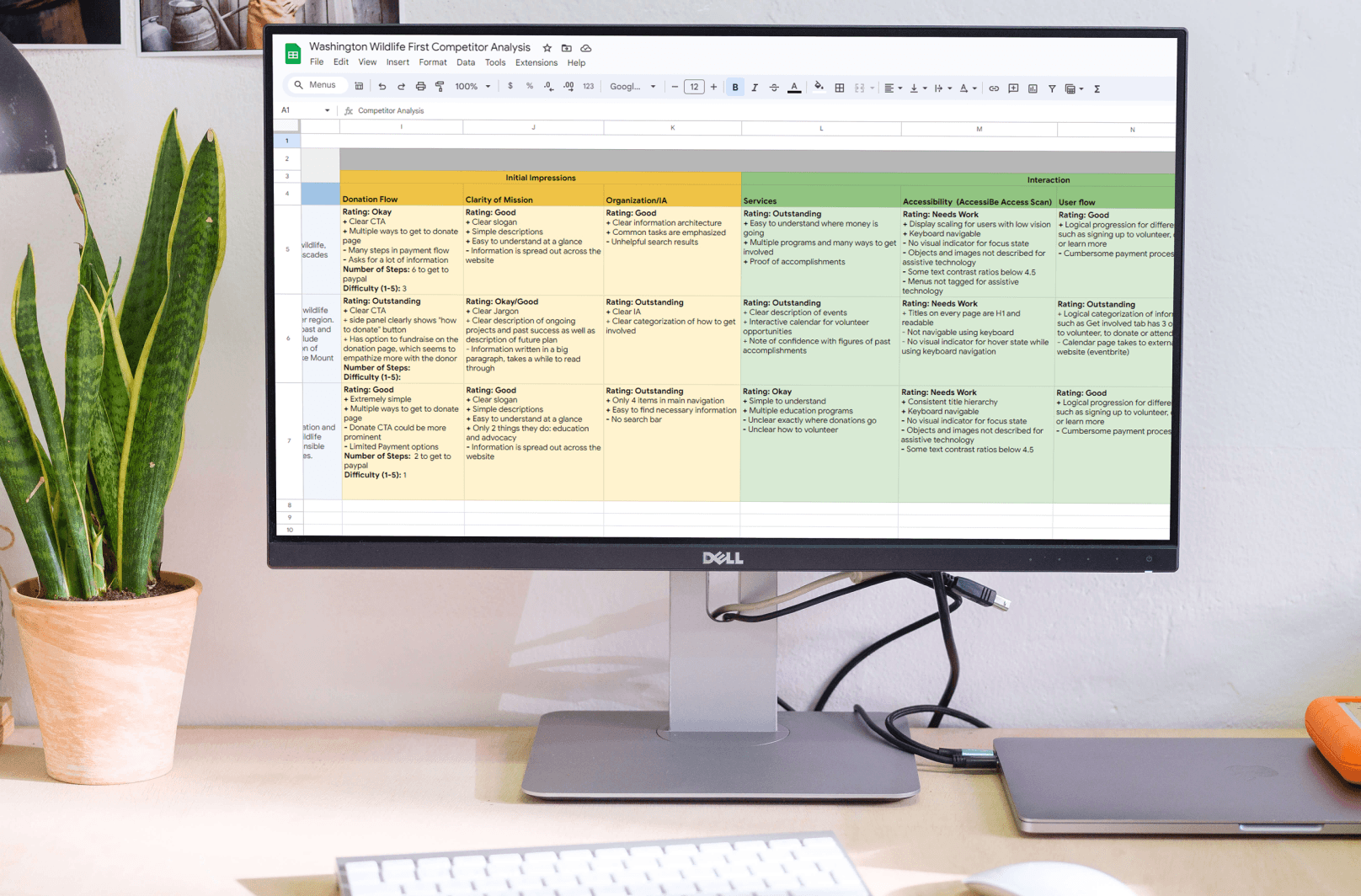
Competitors struggle with accessibility, brand identity, and clarity of mission.
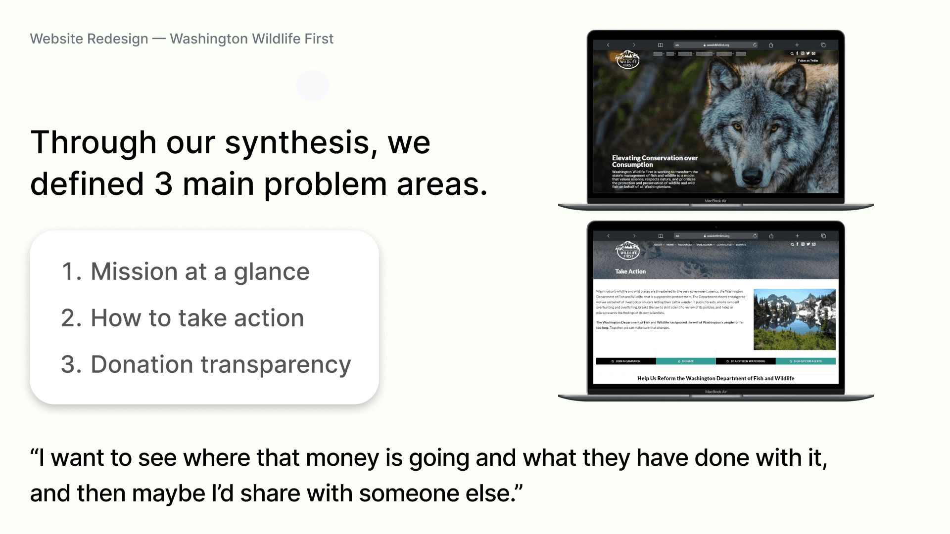
40% of users couldn’t understand the mission within 10 seconds.
Users struggled to find current ways to take action.
No users were confident about where donation money would go.
Putting Pen to Paper
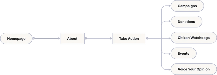
Revising the User Flow
Mobile Sketches

Testing and Iterations
Key Constraint

Replacing placeholder text in the success roadmap emphasizes how the Washington Wildlife First has effectively used donations.

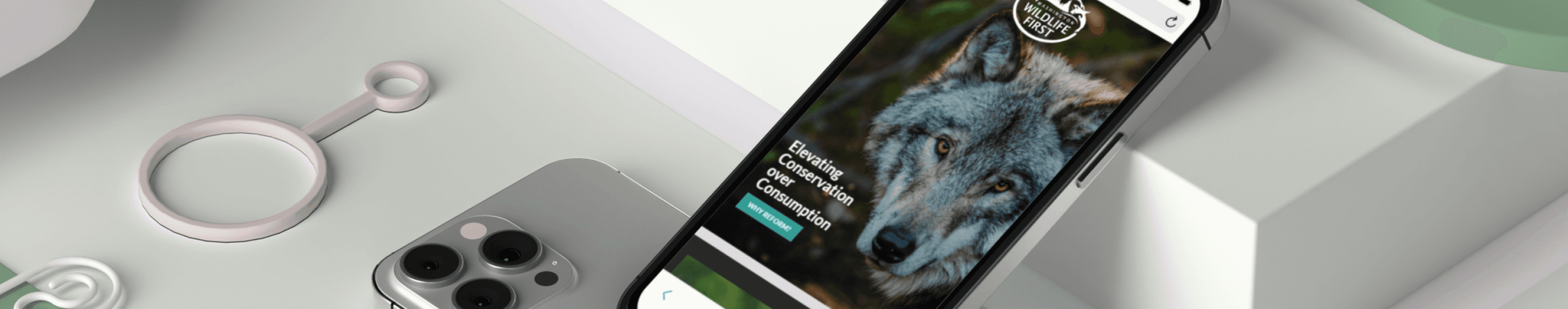
Including powerful imagery alongside simplified mission statements helps users quickly understand and empathize with the organization’s cause.
Campaign Page
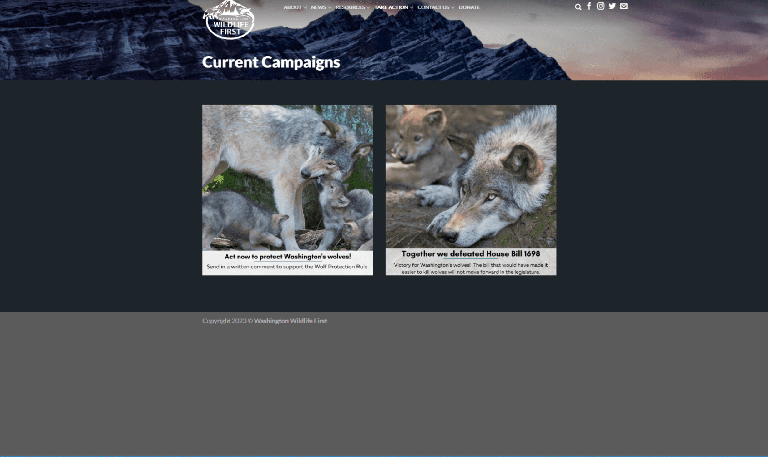
Original:
Some campaigns were not current.
No way to view past campaigns.
Purpose of the page is unclear.
Formal descriptions lacked context.
Visually dark and gloomy.
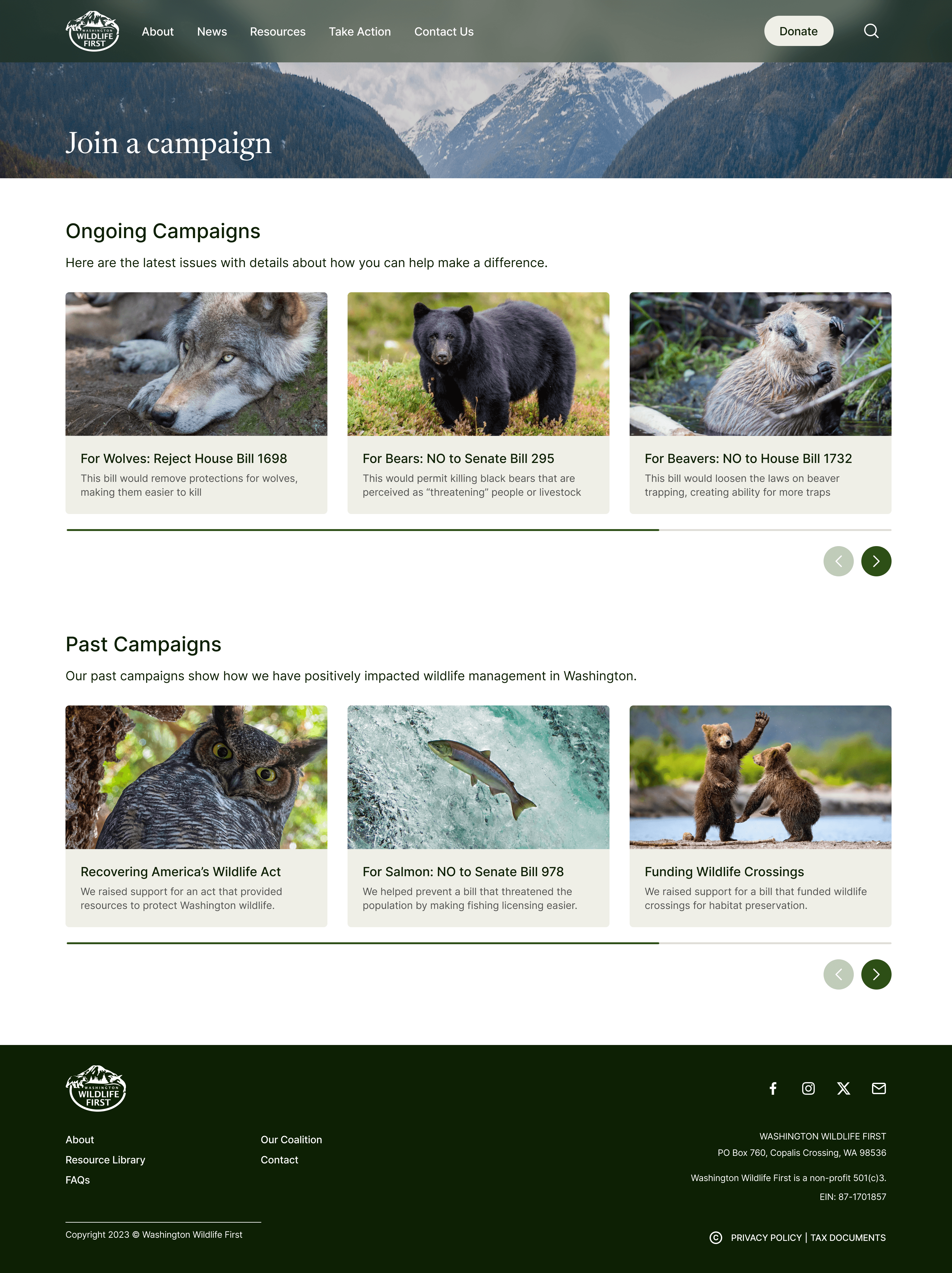
Our Design:
All campaigns are categorized.
Past campaigns demonstrate proof of ability to execute.
Succinct, clear copy clarifies the purpose of the page.
Copy encourages users to learn more and contribute.
Visually bright and vibrant, portraying optimism.
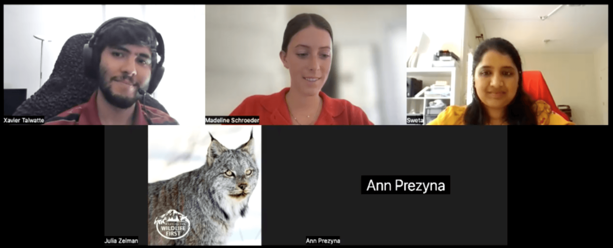
Stakeholder Presentation
The slides pictured above detail how we gathered insights from initial research and used them to inform our direction for the redesign. We used these slides to help stakeholders develop confidence in the quality of our work and the efficacy of our designs.
Developer Handoff
After securing stakeholder buy-in, we met with the developer to evaluate the feasibility of our designs given constraints such as content management system technical constraints, budget and time-frame constraints, organizational constraints, and content-related constraints.
What happens if someone types something in wrong? What would that error message look like?
Is donation selection information remembered if users click the back arrow in their browser?
How will a hover effect translate for a mobile experience?
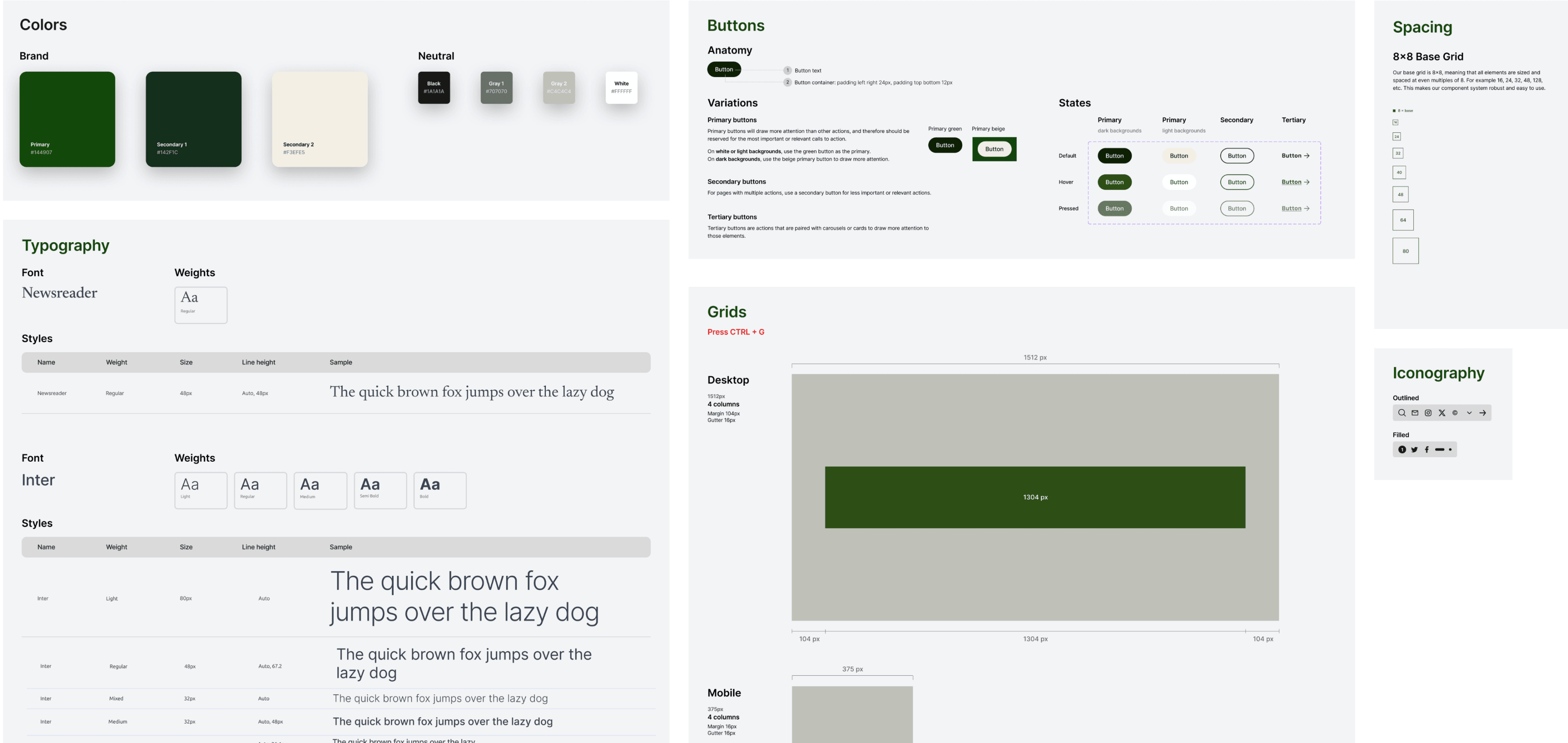
I also worked with the team to identify key revisions to the style guide to clarify documentation for general guidelines and specific exceptions for edge cases.
Key Pages from Final Designs
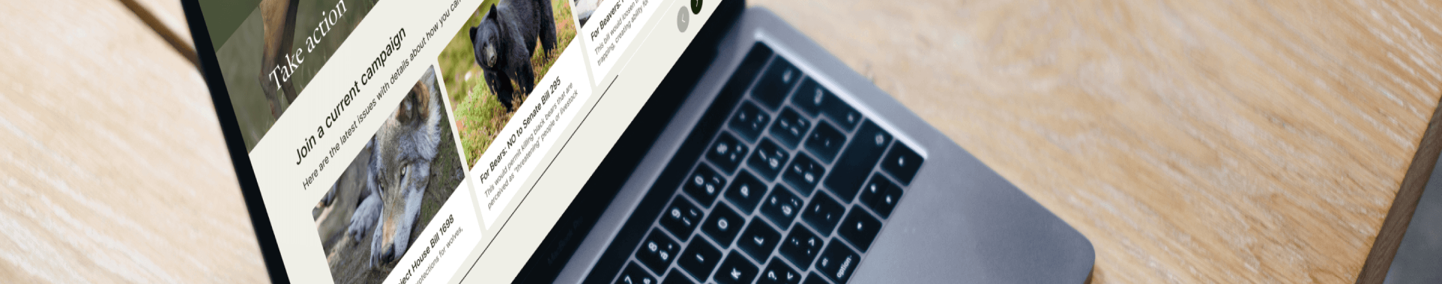
Take Action Page
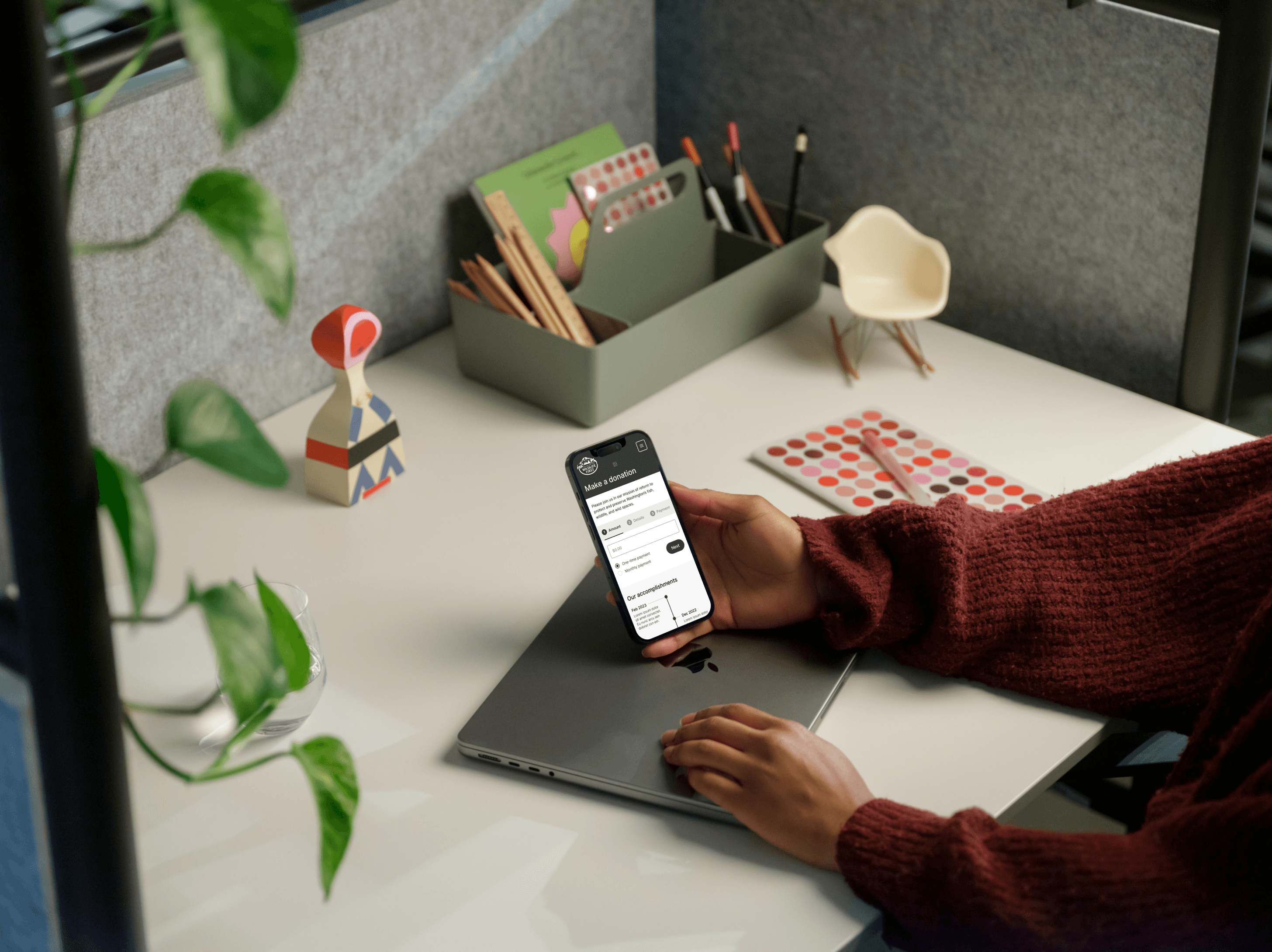
Donation Page
Testimonial
“Xavier Talwatte led a student team that developed redesign recommendations for our nonprofit website. He was the primary communicator for the team and kept us timely apprised of the team’s progress and decision points in a very understandable way. He played a key role in developing the team’s key recommendations to encourage more website traffic and participation by a more diverse audience to donate, attend events, and volunteer. As the spokesperson for the team, Xavier clearly articulated the reasoning behind the teams’ recommendations they had developed from data derived from their user group. We were very impressed with the speed and quality of Xavier’s work. His enthusiasm for the project and our mission was evident from the changes he recommended that are likely to greatly expand our audience. We strongly recommend Xavier for work with other nonprofits interested in redesigning their websites and increasing the size and diversity of their support group.”

Claire Loebs Davis
President and Executive Director

Ann E. Prezyna
Director/Secretary
Outcomes and Conclusion
+300% conversions (20% to 80%)
+44% average mission comprehension (64 to 92%)
+40 NPS (0 to 40)
The stakeholder presentation I created secured buy-in from key stakeholders including the President and board of the organization. The website is currently under development.